Data Morph: Moving Beyond the Datasaurus Dozen
A reminder of why you can't rely solely on summary statistics.
This article introduces Data Morph, a new open source Python package that can be used to morph an input dataset of 2D points into select shapes, while preserving the summary statistics to a given number of decimal points through simulated annealing. Data Morph extends research from Autodesk to create the Datasaurus Dozen, and is intended to be used as a teaching tool for illustrating why you can't rely solely on summary statistics.
Let's play a game. I'm thinking of a distribution with the following summary statistics. Can you picture what a scatter plot of the data would look like?
- X mean = 30.37
- Y mean = 53.01
- X standard deviation = 13.44
- Y standard deviation = 15.53
- Pearson correlation coefficient = 0.04
The mean is a measure of centrality, the standard deviation is a measure of spread from the center, and the correlation quantifies how the x and y variables move together, so it is tempting to think that this is enough to describe the data. However, these summary statistics are insufficient: there are multiple possible datasets for a given set of summary statistics. Here's a scatter plot of the data I was summarizing — did you guess right?
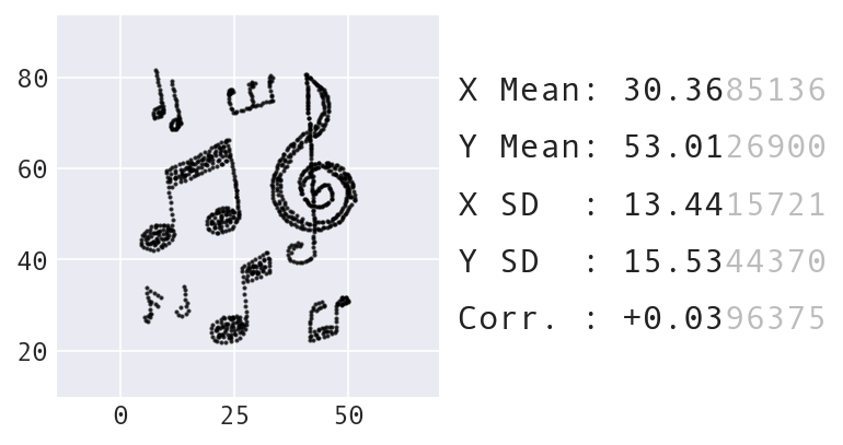
The music dataset provided by Data Morph.
The notion that we cannot rely solely on summary statistics is not new. Researchers have illustrated this by generating many datasets that are very different visually, but share the same summary statistics. In 1973, Francis Anscombe introduced a set of four such datasets that is known as Anscombe's Quartet:
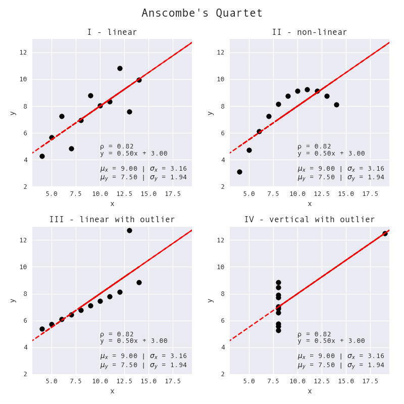
Each of these datasets is very different visually; however, they all share the same summary statistics. (This visual was created by Stefanie Molin using the Anscombe's Quartet dataset as provided in seaborn.)
In 2017, researchers at Autodesk built upon the idea of Anscombe's Quartet to develop the Datasaurus Dozen: they turned a set of points shaped like a dinosaur (Alberto Cairo's Datasaurus) into 12 distinct shapes using simulated annealing, which is a technique for finding global optima, in the Same Stats, Different Graphs project:
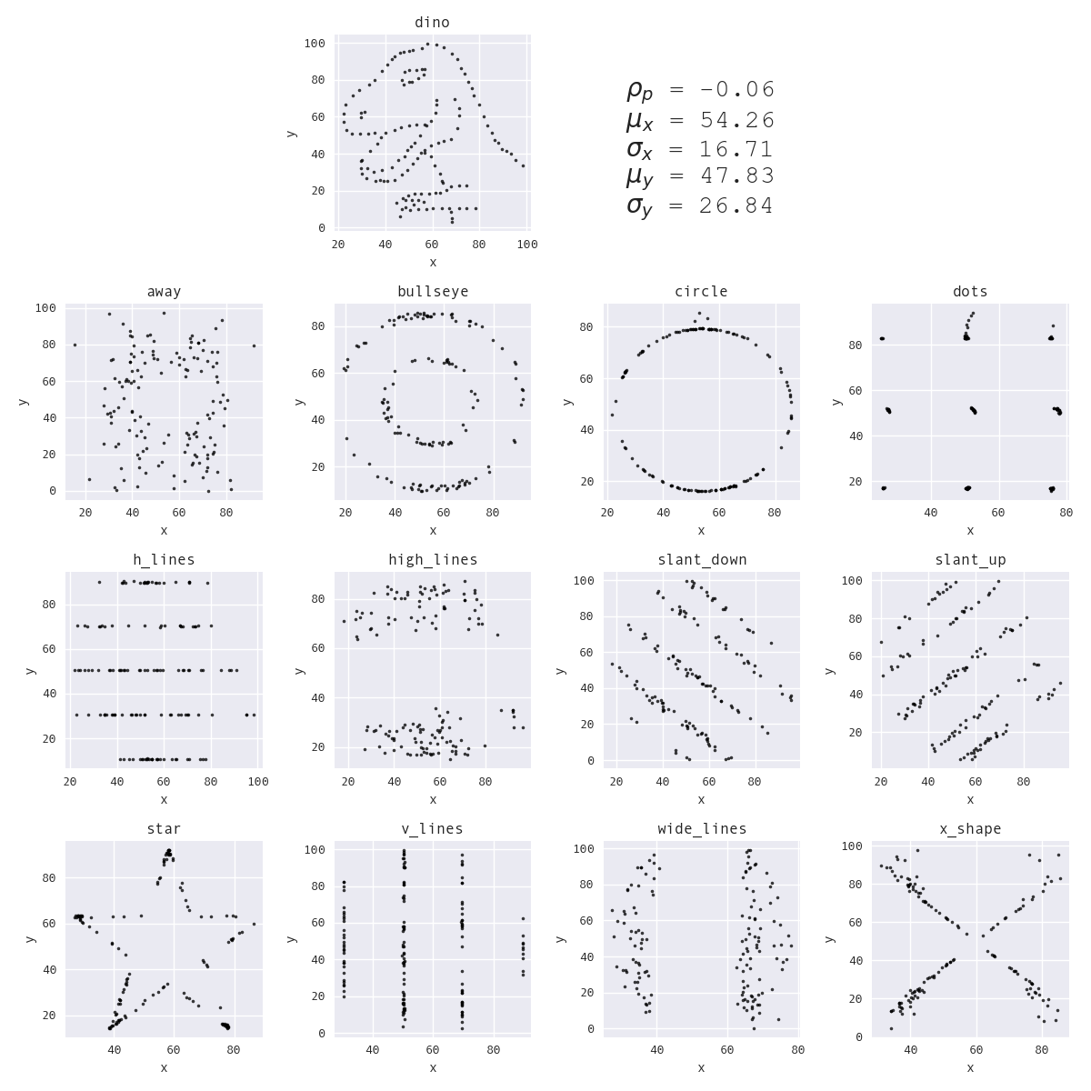
The Datasaurus Dozen datasets. (This visual was created by Stefanie Molin using the Datasaurus Dozen dataset as provided by jmatejka/same-stats-different-graphs.)
To generate the Datasaurus Dozen, the algorithm repeatedly selects a point from the dataset at random and tries to move it to a new position by perturbing it a small, random amount. In order for the new position to be considered, it must only change the summary statistics by a small enough amount such that the old and new values are still equivalent to two decimal places. If the change in position reduces the distance to the target shape, the algorithm moves that point to the new position. However, if it increases the distance to the target shape, the algorithm will only move the point to the new position with some probability, p, which decreases over time. During earlier iterations, the algorithm is more likely to accept new positions that take it farther from target shape; as the iterations pass, this likelihood decreases. This process helps to avoid getting stuck in local optima and allows for more variance in the shapes that can be created since more of the space can be explored.
In comparison to Anscombe's Quartet, there is more of a shock factor watching the Datasaurus transform into a set of slanted lines, while preserving summary statistics. I believe that this shock factor is more effective when it comes to explaining why data visualization is essential — just take a look at the reactions to this LinkedIn post.
I wanted to employ this shock factor in my pandas workshop to motivate the section on data visualization. Coming after the section on data wrangling, it's crucial to emphasize the importance of data visualization at this point because coding up visualizations can be more complicated. People are often tempted to take the shortcut and just use summary statistics to describe the data. However, using the dinosaur for the animation felt off brand for the workshop, which features panda imagery throughout — I needed to make a dataset shaped like a panda. I provide some tips on how to move from an idea to an input dataset here.
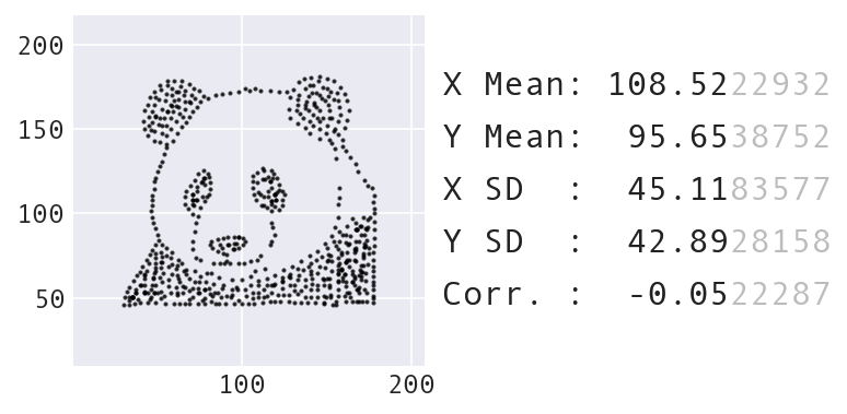
A new starting dataset shaped like a panda.
I quickly realized that custom, impactful visual aids would not only benefit my workshop, but also those learning and teaching data analysis. So in 2023, I explored how the code from the Autodesk researchers could be generalized to an arbitrary dataset, i.e., instead of the Datasaurus or the panda. This led me to create Data Morph, an open source Python package that can be used to morph an input dataset of 2D points into select shapes, while preserving the summary statistics to a given number of decimal points using the same technique of simulated annealing.
There was significant refactoring required to generalize the Same Stats, Different Graphs code so it would work for a different input. All of the logic for the target shapes (think the center and radius for a circle, endpoints for a line, etc.) was hardcoded in the code, and was, therefore, specific to the datasets included with the Autodesk team's code. The positioning and attributes of the target shapes need to be calculated from the starting dataset, with some shapes being much simpler to encode than others. For example, to morph into the circle shape, the center of the circle can be at the mean of the x and y values; the radius can be a multiple of the standard deviation (x or y, pick one):
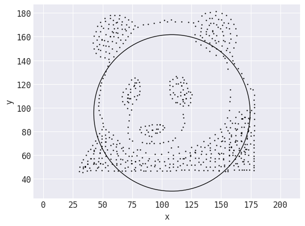
The target shape Data Morph calculates when trying to morph the panda shown previously into a circle. Distances are calculated from the points to the line that forms the circle.
Data Morph provides a hierarchy of shape classes to allow for creating composite shapes (e.g., the circle shape is used to create a bullseye shape, which comprises two concentric circles) and centralizing the distance calculation for streamlined code. However, for some shapes, using information from the data doesn't quite work: points sometimes need to move outside the bounds of the starting dataset. To handle this logic, Data Morph includes some automatic boundary calculations that shapes and plotting functionality plug into:
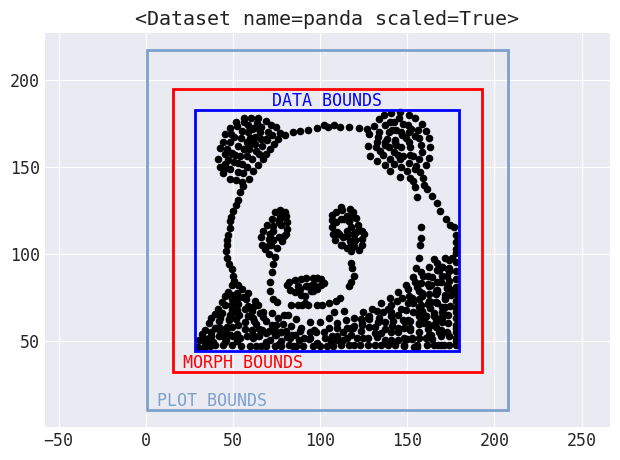
Bounds are automatically calculated for use in morphing and plotting.
Another big change was to decrease the maximum amount the points could move over time, rather than keep it static, which makes for a nicer visual effect as the points move. Here's an example of morphing the panda dataset into a star:
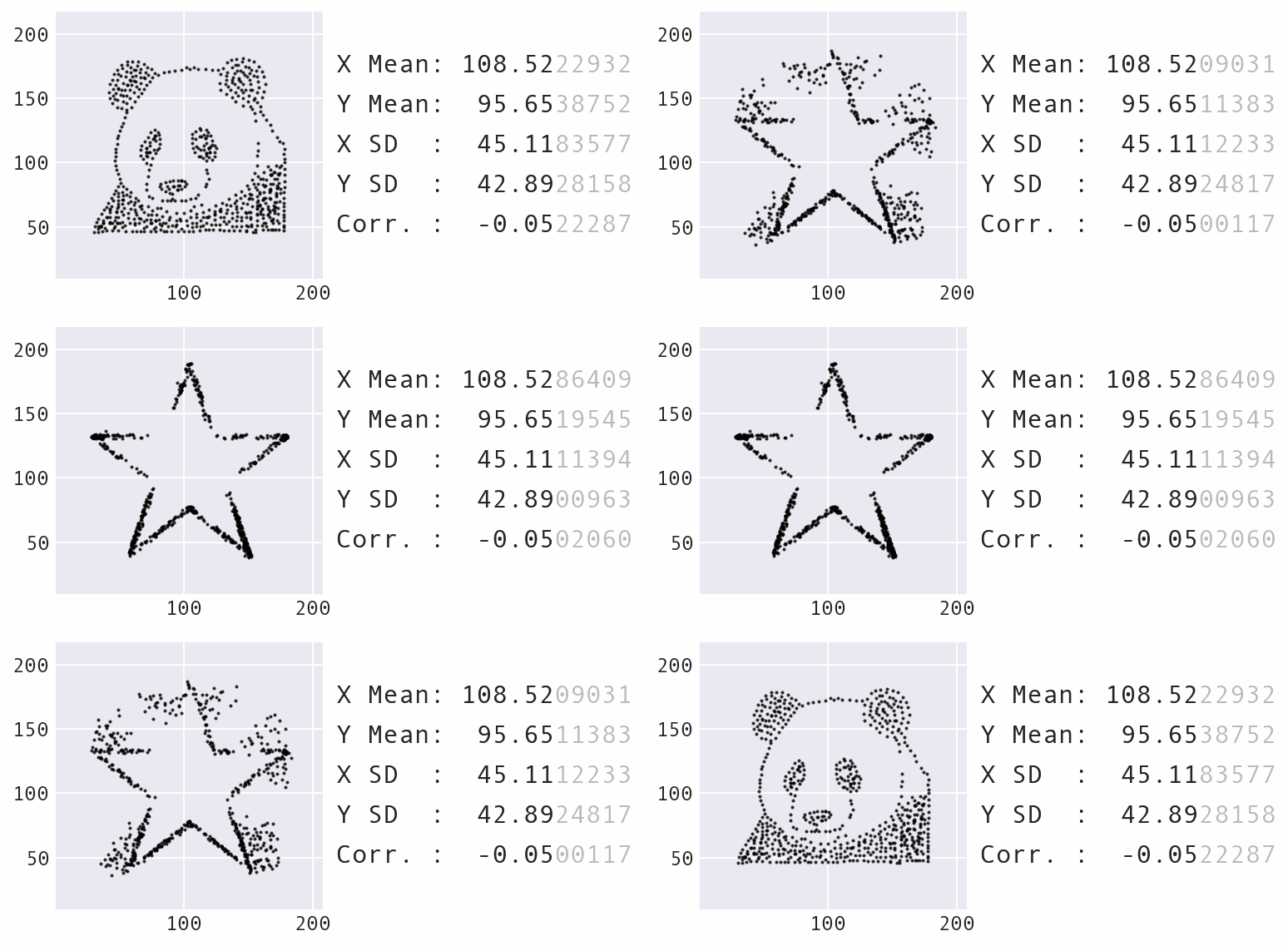
Morphing the panda dataset into a star with Data Morph.
As the animation above shows, the panda and star not only have the same summary statistics, but so does every single dataset encountered along the way in the transformation process. Compound this with the fact that the panda can also be morphed into several other recognizable shapes, such as the circle that was shown previously, and you have an infinite number of possible datasets matching the summary statistics.
However, there are some limitations: you can't always morph a dataset into all target shapes offered by Data Morph. If there aren't any points from the starting shape in a specific region that is part of the target shape, it might not be possible to push the points there without altering the summary statistics. For example, when morphing some input dataset into the rectangle shape, it might be missing some parts of the line(s). Once you play around with different input datasets, you will gain some intuition as to which shapes will work and which won't (and why).
At the time of writing, Data Morph comes with 6 built-in starter shapes and 15 target shapes with more of each to come. Morphing is as simple as this:
pip install data-morph-ai
data-morph --start-shape panda --target-shape star
Arbitrary/custom starting shapes can be provided via CSV files, such as this one (see the documentation here for tips on making your own):
An example created using a CSV file.
Data Morph also provides documentation for both CLI and Python interpreter usage, a test suite, modular code, and a flexible class hierarchy for adding new target shapes. More information on the core improvements can be found in the release notes here.
The next time you find yourself explaining or teaching summary statistics, I invite you to use Data Morph to create a fun, custom animation to emphasize the importance of visualizing the data. Ask students or attendees to come up with their own animations. Seeing numerous examples that start with familiar shapes (e.g., your school logo, mascot, etc.) will keep this important concept top of mind. If you end up using Data Morph with a custom dataset and/or for teaching purposes, I'd love to hear about it — tag me in your posts on LinkedIn or Twitter.
Happy morphing!
Never miss a post: sign up for my newsletter.

