How to Pivot and Plot Data with Pandas
Analyzing 2019 airline market share.

Photo by Stone Wang on Unsplash
A big challenge of working with data is manipulating its format for the analysis at hand. To make things a bit more difficult, the "proper format" can depend on what you are trying to analyze, meaning we have to know how to melt, pivot, and transpose our data.
In this article, we will discuss how to create a pivot table of aggregated data in order to make a stacked bar visualization of the 2019 airline market share for the top 10 destination cities. All the code for this analysis is available on GitHub here and can also be run using this Binder environment.
We will be using 2019 flight statistics from the United States Department of Transportation's Bureau of Transportation Statistics (available here). It contains 321,409 rows and 41 columns:
import pandas as pd

df = pd.read_csv('865214564_T_T100_MARKET_ALL_CARRIER.zip')
df.shape
(321409, 41)
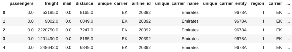
Each row contains monthly-aggregated information on flights operated by a variety of airline carriers, including both passenger and cargo service. Note that the columns are all in uppercase at the moment:
df.columns
Index(['PASSENGERS', 'FREIGHT', 'MAIL', 'DISTANCE',
       'UNIQUE_CARRIER', 'AIRLINE_ID', 'UNIQUE_CARRIER_NAME',
       'UNIQUE_CARRIER_ENTITY', 'REGION', 'CARRIER', 'CARRIER_NAME',
       'CARRIER_GROUP', 'CARRIER_GROUP_NEW', 'ORIGIN_AIRPORT_ID',
       'ORIGIN_AIRPORT_SEQ_ID', 'ORIGIN_CITY_MARKET_ID', 'ORIGIN',
       'ORIGIN_CITY_NAME', 'ORIGIN_STATE_ABR', 'ORIGIN_STATE_FIPS',
       'ORIGIN_STATE_NM', 'ORIGIN_COUNTRY', 'ORIGIN_COUNTRY_NAME',
       'ORIGIN_WAC', 'DEST_AIRPORT_ID', 'DEST_AIRPORT_SEQ_ID',
       'DEST_CITY_MARKET_ID', 'DEST', 'DEST_CITY_NAME',
       'DEST_STATE_ABR', 'DEST_STATE_FIPS', 'DEST_STATE_NM',
       'DEST_COUNTRY', 'DEST_COUNTRY_NAME', 'DEST_WAC', 'YEAR',
       'QUARTER', 'MONTH', 'DISTANCE_GROUP', 'CLASS',
       'DATA_SOURCE'],
      dtype='object')
To make the data easier to work with, we will transform the column names into lowercase using the rename() method:
df = df.rename(lambda x: x.lower(), axis=1)
df.head()
For our analysis, we want to look at passenger airlines to find the 2019 market share of the top 5 carriers (based on total number of passengers in 2019). To do so, we first need to figure out which carriers were in the top 5. Remember, the data contains information on all types of flights, but we only want passenger flights, so we first query df for flights marked F in the class column (note that we need backticks to reference this column because class is a reserved keyword in Python). Then, we group by the carrier name and sum each carrier's passenger counts. Finally, we call the nlargest() method to return only the top 5:
top_airlines = df.query('`class` == "F"')\
    .groupby('unique_carrier_name').passengers.sum()\
    .nlargest(5)
top_airlines
unique_carrier_name
Southwest Airlines Co.    162681011.0
Delta Air Lines Inc.      162260114.0
American Airlines Inc.    155782611.0
United Air Lines Inc.     116212143.0
JetBlue Airways            42830602.0
Name: passengers, dtype: float64
Download flight class meanings here.
Note that the top 5 airlines also run flights of a different class, so we can't remove this filter for the rest of our analysis:
df.loc[
    df.unique_carrier_name.isin(top_airlines.index), 'class'
].value_counts()
F    97293
L     3994
Name: class, dtype: int64
Now, we can create the pivot table; however, we cannot filter down to the top 5 airlines just yet, because, in order to get market share, we need to know the numbers for the other airlines as well. Therefore, we will build a pivot table that calculates the total number of passengers each airline flew to each destination city. To do so, we specify that we want the following in our call to the pivot_table() method:
- Unique values in the
dest_city_namecolumn should be used as our row labels (theindexargument) - Unique values in the
unique_carrier_namecolumn should be used as our column labels (thecolumnsargument) - The values used for the aggregation should come from the
passengerscolumn (thevaluesargument), and they should be summed (theaggfuncargument) - Row/column subtotals should be calculated (the
marginsargument)
Finally, since we want to look at the top 10 destinations, we will sort the data in descending order using the All column, which contains the total passengers flown to each city in 2019 for all carriers combined (this was created by passing in margins=True in the call to the pivot_table() method):
pivot = df.query('`class` == "F"').pivot_table(
    index='dest_city_name',
    columns='unique_carrier_name',
    values='passengers',
    aggfunc='sum',
    margins=True
).sort_values('All', ascending=False)
pivot.head(10)
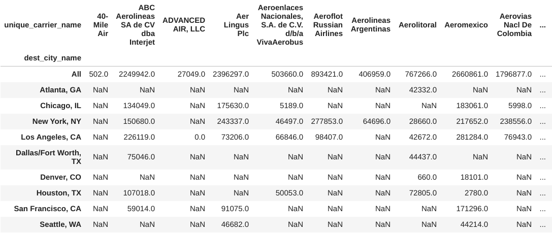
Notice that the first row in the previous result is not a city, but rather, the subtotal by airline, so we will drop that row before selecting the first 10 rows of the sorted data:
pivot = pivot.drop('All').head(10)
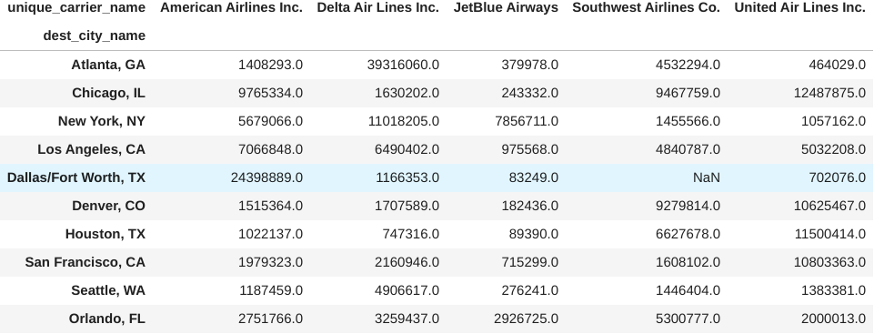
Selecting the columns for the top 5 airlines now gives us the number of passengers that each airline flew to the top 10 cities. Note that we use sort_index() so that the resulting columns are displayed in alphabetical order:
pivot[top_airlines.sort_index().index]
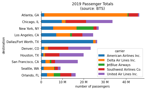
Our data is now in the right format for a stacked bar plot showing passenger counts. To make this visualization, we call the plot() method on the previous result and specify that we want horizontal bars (kind='barh') and that the different airlines should be stacked (stacked=True). Note that since we have the destinations sorted in descending order, Atlanta will be plotted on the bottom, so we call invert_yaxis() on the Axes object returned by plot() to flip the order:
from matplotlib import ticker

ax = pivot[top_airlines.sort_index().index].plot(
    kind='barh', stacked=True,
    title='2019 Passenger Totals\n(source: BTS)'
)

# put destinations with more passengers on top
ax.invert_yaxis()

# formatting
ax.set(xlabel='number of passengers', ylabel='destination')
ax.legend(title='carrier')

# shows x-axis in millions instead of scientific notation
ax.xaxis.set_major_formatter(ticker.EngFormatter())

# removes the top & right lines from the figure to make it less boxy
for spine in ['top', 'right']:
    ax.spines[spine].set_visible(False)
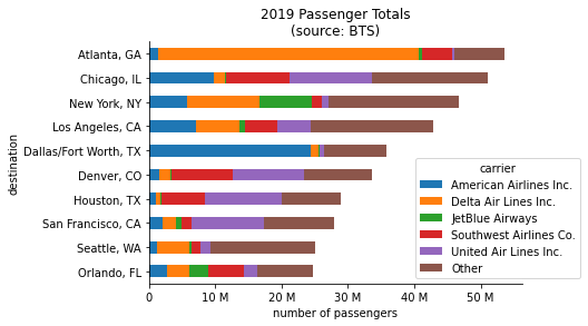
One interesting thing to notice from the previous result is that Seattle is a top 10 destination, yet the top 5 carriers don't appear to be contributing as much to it as the rest of the destination cities, which are pretty much in the same order with the exception of Los Angeles. This could cause some confusion, so let's add in another stacked bar called Other that contains the passenger totals for all airlines not in the top 5. Since we calculated the All column when we created the pivot table, all we have to do here is add a column to our filtered data that contains the All column minus the top 5 airlines' passenger totals summed together. The plotting code only needs to be modified to shift the legend further out:
ax = pivot[top_airlines.sort_index().index].assign(
    Other=lambda x: pivot.All - x.sum(axis=1)
).plot(
    kind='barh', stacked=True,
    title='2019 Passenger Totals\n(source: BTS)'
)
ax.invert_yaxis()

# formatting
ax.set(xlabel='number of passengers', ylabel='destination')
ax.xaxis.set_major_formatter(ticker.EngFormatter())

# shift legend to not cover the bars
ax.legend(
    title='carrier', bbox_to_anchor=(0.7, 0), loc='lower left'
)

for spine in ['top', 'right']:
    ax.spines[spine].set_visible(False)
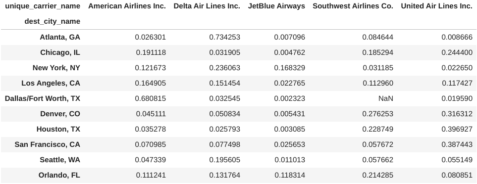
We can now clearly see that Atlanta had the most passengers arriving in 2019 and that flights from Delta Air Lines were the biggest contributor. But, we can do better by representing market share as the percentage of all passengers arriving in each destination city. In order to do that, we need to modify our pivot table by dividing each airline’s passenger counts by the All column:
normalized_pivot = pivot[top_airlines.sort_index().index].apply(
    lambda x: x / pivot.All
)
normalized_pivot
Before plotting, we will also sort the bars by the total market share of the top 5 carriers. Viewing this information as percentages gives us a better idea of which carriers dominate which markets – Delta has by far the largest share of Atlanta and American Airlines has over 60% of Dallas/Fort Worth, while United has strong footholds in several markets:
# determine sort order
market_share_sorted = normalized_pivot.sum(axis=1).sort_values()
ax = normalized_pivot.loc[market_share_sorted.index,:].plot(
    kind='barh', stacked=True, xlim=(0, 1),
    title='2019 Market Share\n(source: BTS)'
)

# formatting
ax.set(
    xlabel='percentage of all passengers', ylabel='destination'
)
ax.legend(
    title='carrier', bbox_to_anchor=(0.7, 0), loc='lower left'
)

# show x-axis as percentages
ax.xaxis.set_major_formatter(ticker.PercentFormatter(xmax=1))
for spine in ['top', 'right']:
    ax.spines[spine].set_visible(False)
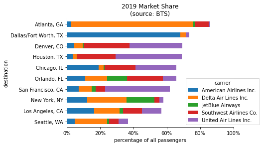
As we noticed earlier, Seattle sticks out. The top 5 carriers have more than 50% combined market share for 9 out of the top 10 destinations, but not for Seattle. Using our pivot table, we can see that Alaska Airlines is the top carrier for Seattle:
pivot.loc['Seattle, WA', :].nlargest(6)
unique_carrier_name
All                       25084302.0
Alaska Airlines Inc.       9637977.0
Delta Air Lines Inc.       4906617.0
Horizon Air                2454491.0
Southwest Airlines Co.     1446404.0
United Air Lines Inc.      1383381.0
Name: Seattle, WA, dtype: float64
Now, it’s your turn.
In this article, we explored just a few of the many powerful features in the pandas library that make data analysis easier. While we only used a small subset of the columns, this dataset is packed with information that can be analyzed using a pivot table: try looking into origin cities, freight/mail carriers, or even flight distance.
Be sure to check out my pandas workshop for an in-depth introduction to pandas. Or pick up my book, "Hands-On Data Analysis with Pandas," for a thorough exploration of the pandas library using real-world datasets, along with matplotlib, seaborn, and scikit-learn. For more advanced data visualizations, including animations and interactivity, check out my Beyond the Basics: Data Visualization in Python workshop.
Originally posted on May 27, 2021 at OpenDataScience.com.
Never miss a post: sign up for my newsletter.