Data Morph
A Cautionary Tale of Summary Statistics
Stefanie Molin
Bio
- 👩🏻💻 Software engineer at Bloomberg in NYC
- ✨ Founding member of Bloomberg's Data Science Community
- ✍ Author of "Hands-On Data Analysis with Pandas"
- 🎓 Bachelor's in operations research from Columbia University
- 🎓 Master's in computer science (ML specialization) from Georgia Tech
Summary statistics aren't enough
These datasets are clearly different:
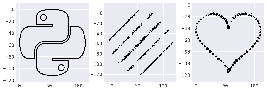
However, we would not know that if we were to only look at the summary statistics:
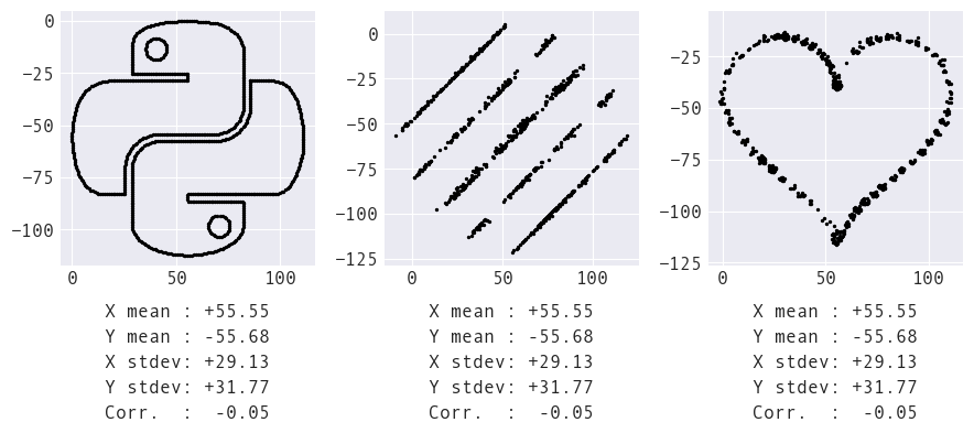
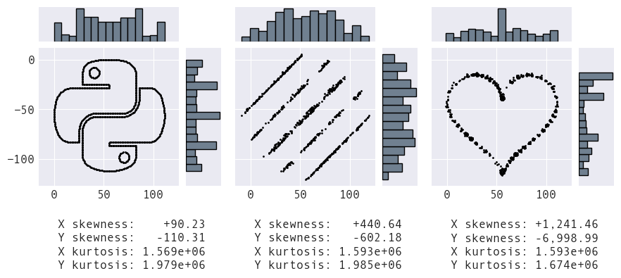
What we call summary statistics summarize only part of the distribution. We need many moments to describe the shape of a distribution (and distinguish between these datasets):
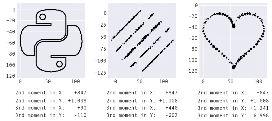
Adding in histograms for the marginal distributions, we can see the distributions of both x and y are indeed quite different across datasets. Some of these differences are captured in the third moment (skewness) and the fourth moment (kurtosis), which measure the asymmetry and weight in the tails of the distribution, respectively:
However, the moments aren't capturing the relationship between x and y. If we suspect a linear relationship, we may use the Pearson correlation coefficient, which is the same for all three datasets below. Here, the visualization tells us a lot more information about the relationships between the variables:
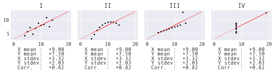
The Pearson correlation coefficient measures linear correlation. For example, all four datasets in Anscombe's Quartet (constructed in 1973) have strong correlations, but only I and III have linear relationships:
Visualization is an essential part of any data analysis.
In their 2020 paper, A hypothesis is a liability, researchers Yanai and Lercher argue that simply approaching a dataset with a hypothesis may limit the thoroughness to which the data is explored.
Let's take a look at their experiment.
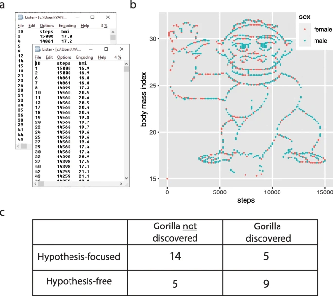
The experiment
Students in a statistical data analysis course were split into two groups. One group was given the open-ended task of exploring the data, while the other group was instructed to test the following hypotheses:
- There is a difference in the mean number of steps between women and men.
- The correlation coefficient between steps and BMI is negative for women.
- The correlation coefficient between steps and BMI is positive for men.
Here's what that dataset looked like:
How can we encourage students and practitioners alike to be more thorough in their analyses?
Create more memorable teaching aids
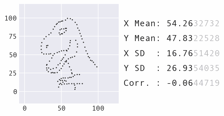
In 2017, Autodesk researchers created the Datasaurus Dozen, building upon the idea of Anscombe's Quartet to make a more impactful example:
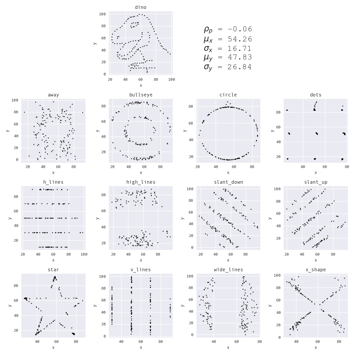
They also employed animation, which is even more impactful. Every shape as we transition between the Datasaurus and the circle shares the same summary statistics:
This visual was created by Stefanie Molin using Data Morph.
But, now we have a new problem...
What's so special about the Datasaurus?
NOTHING!
Since there was no easy way to do this for arbitrary datasets, people assumed that this capability is a property of the Datasaurus and were shocked to see this work with other shapes. The more ways people see this and the more memorable they are, the better this concept will stick – repetition is key to learning.
This is why I built Data Morph.
Data Morph is an educational tool
It addresses the limitations of previous methods:
- installable Python package that can be used without hacking at the codebase
- animated results are provided automatically
- possible to use additional datasets (built-in and custom)
- people can experiment with their own datasets and various target shapes
- the number of possible examples is no longer frozen
Data Morph (2023)
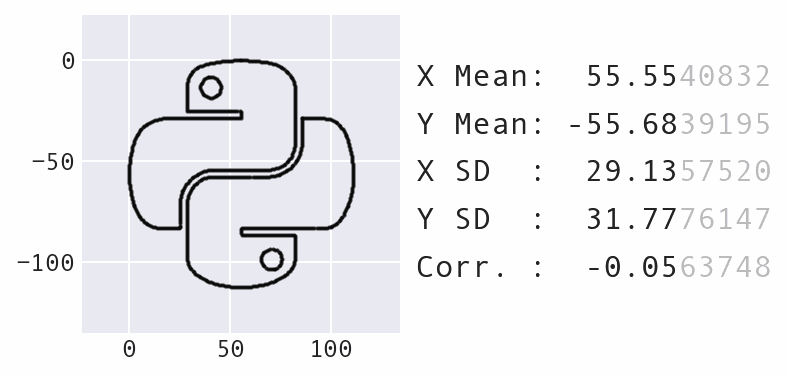
Here's the code to create that example:
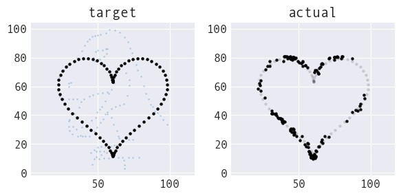
              $ python -m pip install data-morph-ai
              $ data-morph --start Python --target heart
Here's what's going on behind the scenes:
              from data_morph.data.loader import DataLoader
              from data_morph.morpher import DataMorpher
              from data_morph.shapes.factory import ShapeFactory


              dataset = DataLoader.load_dataset('Python')
              target_shape = ShapeFactory(dataset).generate_shape('heart')

              morpher = DataMorpher(decimals=2, in_notebook=False)
              _ = morpher.morph(dataset, target_shape)
A high-level overview of how it works
1. Select a starting dataset
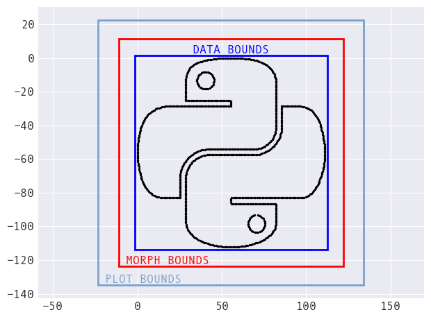
Automatically-calculated bounds
Data Morph provides the Dataset class that wraps the
data (stored as a pandas.DataFrame) with information
about bounds for the data, the morphing process, and plotting. This
allows for the use of arbitrary datasets by providing a way to
calculate target shapes – no more hardcoded values.
Built-in datasets
To spark creativity, there are built-in datasets to inspire you:
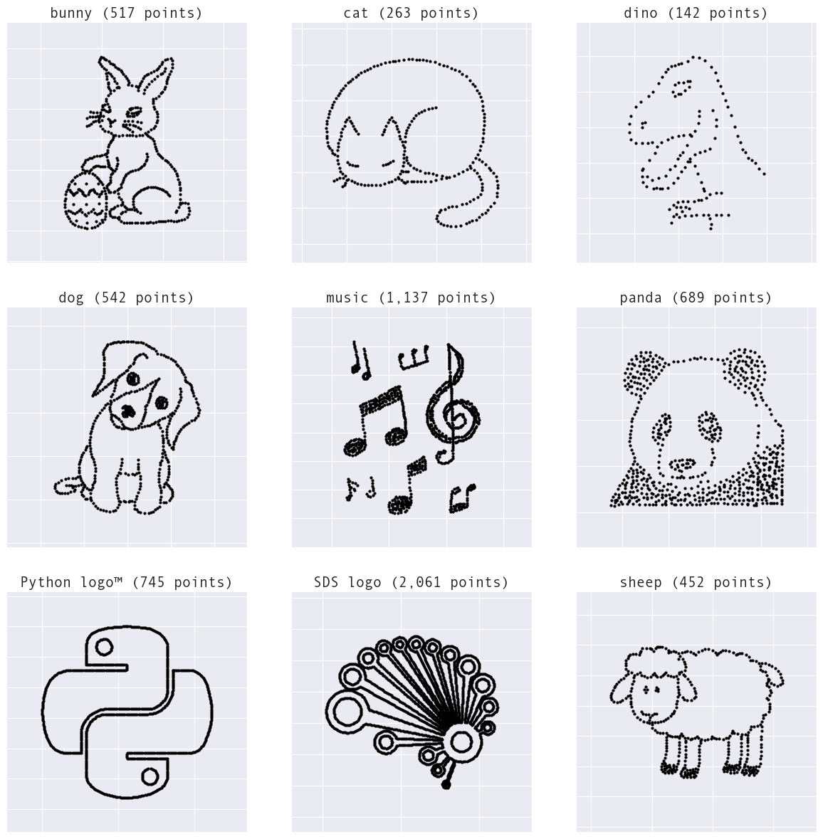
Note: Currently displaying what's available as of the v0.3.0 release. All logos are used with permission.
2. Generate a target shape based on the dataset
Scaling and translating target shapes
Depending on the target shape, bounds and/or statistics from the dataset are used to generate a custom target shape for the dataset to morph into.
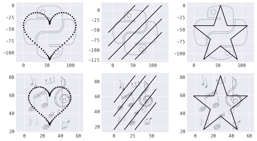
Built-in target shapes
The following target shapes are currently available:
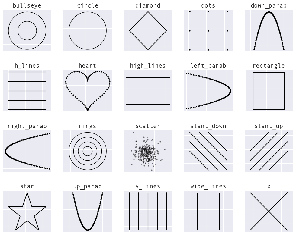
Note: Currently displaying what's available as of the v0.3.0 release.
The Shape class hierarchy
In Data Morph, shapes are structured as a hierarchy of classes,
which must provide a distance() method. This makes them
interchangeable in the morphing logic.

Note: The ... boxes represent classes omitted for space.
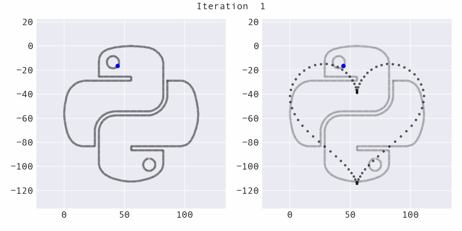
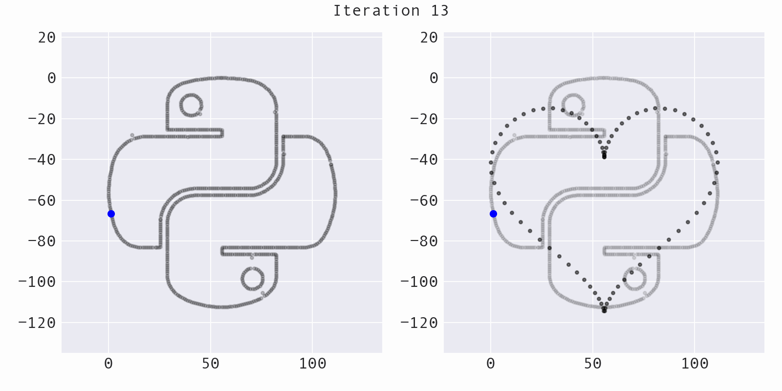
3. Morph the dataset into the target shape
Simulated annealing
A point is selected at random (blue) and moved a small, random amount to a new location (red), preserving summary statistics. This part of the codebase comes from the Autodesk research and is mostly unchanged:
Avoiding local optima
Sometimes, the algorithm will move a point away from the target shape (increasing the distance, instead of decreasing it), while still preserving summary statistics. This helps to avoid getting stuck:
The likelihood of moving a point away from the target shape decreases over time and is governed by the temperature of the simulated annealing process:
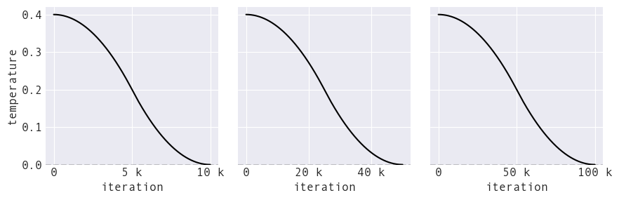
The temperature falls to zero as we near the final iterations, meaning we become more strict about moving toward the target shape to finalize the output.
Decreasing point movement over time
The maximum amount that a point can move at a given iteration decreases over time for a better visual effect. This makes points move faster when the morphing starts and slow down as we approach the target shape:

Unlike temperature, we don't allow this value to fall to zero, since we don't want to halt movement:
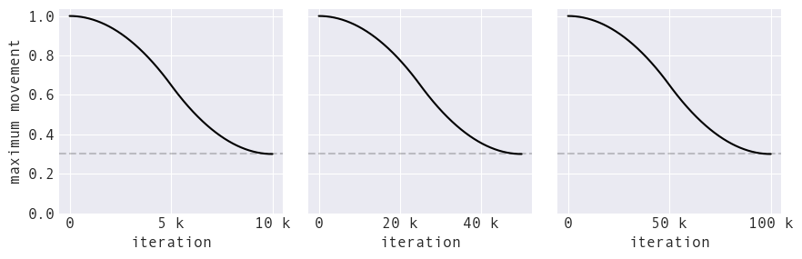
Maximum point movement decreases over time just as temperature does.
Limitations and areas for future work
“Bald spots”
How do we encourage points to fill out the target shape and not just clump together?
Morphing direction
Currently, we can only morph from dataset to shape (and shape to dataset by playing the animation in reverse). I would like to support dataset to dataset and shape to shape morphing, but there are challenges to both:
| Goal | Challenges |
|---|---|
| shape→shape | determining the initial sizing and possibly aligning scale across the shapes, and solving the bald spot problem |
| dataset→dataset | defining a distance metric, determining scale and position of target, and solving the bald spot problem |
Speed
The algorithm from the original research is largely untouched and parts of it could potentially be vectorized to speed up the morphing process.
Data scale affects morphing time
Smaller values (left subplot) morph in fewer iterations than larger values (right subplot) since we only move small amounts at a time:
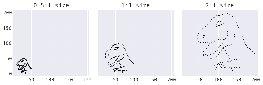
Converting each of these into the circle shape takes ~25K iterations for the half-scale, ~50K iterations for the actual scale, and ~77.5K iterations for the scaled-up version.
Convergence
- Currently: The user specifies the number of iterations to run. For datasets with small values, convergence might happen earlier; for datasets with larger values, this might happen well after this number of iterations.
- Goal: The user would specify the maximum number of iterations and the algorithm would stop early if the dataset had converged to the target shape.
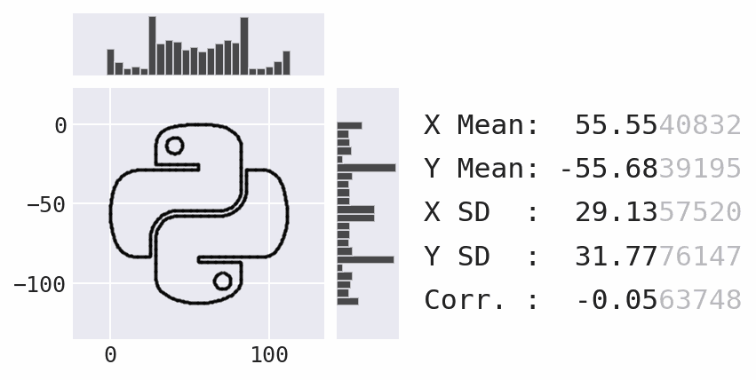
Coming soon: marginal plots
Lessons learned and challenges faced
Repeating research is hard
My first step was to use the Autodesk researchers' code to recreate the conversion of the Datasaurus into a circle and figure out how the code worked.
Challenges at this stage:
- Limited or no code documentation
- Partial codebase with unused variables and functions
- Generic variable names
TIME TAKEN: 4 hours
Extending research is harder
From there, I tried to get it to work with a panda-shaped dataset, reworked to have similar statistics to the Datasaurus.
Challenges at this stage:
- Limited or no code documentation
- Partial codebase with unused variables and functions
- Hardcoded values (some of which were related to the data)
TIME TAKEN: 1.75 days
Building and distributing a package is a lot of work
Once I got the transformation working with the panda (my original goal), I realized this would be a helpful teaching tool and decided to make a package.
Challenges at this stage:
- Purging unused variables and functions
- Refactoring a monolithic codebase
- Figuring out how to apply the algorithm to arbitrary datasets
- Writing a pre-commit hook to validate numpydoc-style docstrings (PR 454)
- Building and hosting documentation
- Creating a robust test suite from scratch
- Publishing to PyPI and conda-forge
- Automating workflows with GitHub Actions
TIME TAKEN: 2 months (v0.1.0)
Side note: Don't completely trust the docs
Here are some cases I bumped into while building Data Morph:
Helpful resources
- Configuring setuptools using pyproject.toml files – Python Packaging Authority
- Packaging Python Packages – Python Packaging Authority
- Building and hosting documentation on GitHub Pages – Aya Elsayed and Olga Matoula
- Python Packaging Tutorial: The Conda Way – Bianca Henderson, Mahe Iram Khan, Valerio Maggio, and Dave Clements
- Building and testing Python – GitHub Actions docs
Closing remarks
- Summary statistics alone aren't enough to describe your data.
- Visualization is essential, but a single plot won't suffice.
- Try out Data Morph!
python -m pip install data-morph-aiconda install -c conda-forge data-morph-ai- docs: stefaniemolin.com/data-morph
- repo: github.com/stefmolin/data-morph
- classroom activities: github.com/stefmolin/data-morph/#data-morph-in-the-classroom
References
- Anscombe, F.J. (1973). Graphs in Statistical Analysis. The American Statistician 27, 1, 17‐21. https://www.tandfonline.com/doi/abs/10.1080/00031305.1973.10478966
- Matejka, J., Fitzmaurice, G. (2017). Same Stats, Different Graphs: Generating Datasets with Varied Appearance and Identical Statistics through Simulated Annealing. In Proceedings of the 2017 CHI Conference on Human Factors in Computing Systems (CHI '17). Association for Computing Machinery, New York, NY, USA, 1290‐1294. https://doi.org/10.1145/3025453.3025912
- Yanai, I., Lercher, M. (2020). A hypothesis is a liability. Genome Biol 21, 231. https://doi.org/10.1186/s13059-020-02133-w
- Yanai, I, Lercher, M. (2020). Selective attention in hypothesis-driven data analysis. BioRxiv. https://doi.org/10.1101/2020.07.30.228916
Thank you!
I hope you enjoyed the session. You can follow my work on these platforms:
")