Bio
- 👩💻 Software engineer at Bloomberg in NYC
- 🚀 Core developer of numpydoc
- ✍️ Author of Hands-On Data Analysis with Pandas (currently in its second edition; translated into Korean and Simplified Chinese)
- 🎓 Bachelor's degree in operations research from Columbia University
- 🎓 Master's degree in computer science (ML specialization) from Georgia Tech
Prerequisites
- To follow along with this workshop, you will need to either configure a local environment or use a cloud solution like GitHub Codespaces. Consult the README for step-by-step setup instructions.
- In addition, you should have basic knowledge of Python and be comfortable working in Jupyter Notebooks; if not, check out the resources here to get up to speed.
Session Outline
- Getting Started With Matplotlib
- Moving Beyond Static Visualizations
- Building Interactive Visualizations for Data Exploration

Section 1: Getting Started With Matplotlib
We will begin by familiarizing ourselves with Matplotlib. Moving beyond the default options, we will explore how to customize various aspects of our visualizations. By the end of this section, you will be able to generate plots using the Matplotlib API directly, as well as customize the plots that libraries like pandas and Seaborn create for you.

Learning Path
- Why start with Matplotlib?
- Matplotlib basics
- Plotting with Matplotlib
Why start with Matplotlib?
There are many libraries for creating data visualizations in Python (even more if you include those that build on top of them). In this section, we will learn about Matplotlib's role in the Python data visualization ecosystem before diving into the library itself.
Matplotlib is a comprehensive library for creating static, animated, and interactive visualizations in Python. [It] makes easy things easy and hard things possible.
We will start by working with the stackoverflow.zip dataset, which contains the title and tags for all Stack Overflow questions tagged with a select few Python libraries since Stack Overflow's inception (Sept. 2008) through Sept. 12, 2021. The data comes from the Stack Overflow API – more information can be found in this notebook. Here, we are aggregating the data monthly to get the total number of questions per library per month:
import pandas as pd
stackoverflow_monthly = pd.read_csv(
'../data/stackoverflow.zip', parse_dates=True, index_col='creation_date'
).loc[:'2021-08','pandas':'bokeh'].resample('1ME').sum()
stackoverflow_monthly.sample(5, random_state=1)
| pandas | matplotlib | numpy | seaborn | geopandas | geoviews | altair | yellowbrick | vega | holoviews | hvplot | bokeh | |
|---|---|---|---|---|---|---|---|---|---|---|---|---|
| creation_date | ||||||||||||
| 2018-06-30 | 2690 | 612 | 931 | 75 | 12 | 0 | 9 | 0 | 10 | 9 | 0 | 82 |
| 2014-12-31 | 417 | 280 | 420 | 17 | 1 | 0 | 0 | 0 | 0 | 0 | 0 | 20 |
| 2012-12-31 | 124 | 159 | 209 | 0 | 0 | 0 | 0 | 0 | 0 | 0 | 0 | 0 |
| 2011-04-30 | 2 | 58 | 101 | 0 | 0 | 0 | 0 | 0 | 0 | 0 | 0 | 0 |
| 2011-08-31 | 0 | 74 | 124 | 0 | 0 | 0 | 0 | 0 | 0 | 0 | 0 | 0 |
Source: Stack Exchange Network
Those familiar with pandas have likely used the plot() method to generate visualizations. We will start by configuring our Matplotlib plotting backend to generate SVG output (first argument) with custom metadata (second argument):
import matplotlib_inline
from utils import mpl_svg_config
matplotlib_inline.backend_inline.set_matplotlib_formats(
'svg', # output images using SVG format
**mpl_svg_config('section-1') # optional: configure metadata
)
Note: The second argument is optional and is used here to make the SVG output reproducible by setting the hashsalt along with some metadata, which will be used by Matplotlib when generating any SVG output (see the utils.py file for more details). Without this argument, different runs of the same plotting code will generate plots that are visually identical, but differ at the HTML level due to different IDs, metadata, etc.
Next, we plot monthly Matplotlib questions over time by calling the plot() method:
stackoverflow_monthly.matplotlib.plot(
figsize=(8, 2), xlabel='creation date', ylabel='total questions',
title='Matplotlib Questions per Month\n(since the creation of Stack Overflow)'
)
<Axes: title={'center': 'Matplotlib Questions per Month\n(since the creation of Stack Overflow)'}, xlabel='creation date', ylabel='total questions'>

Notice that this returns a Matplotlib Axes object since pandas is using Matplotlib as a plotting backend. This means that pandas takes care of a lot of the legwork for us – some examples include the following:
- Creating the figure: source code
- Calling the
Axes.plot()method: source code - Adding titles/labels: source code
While pandas can do a lot of the work for us, there are benefits to understanding how to work with Matplotlib directly.
Flexibility
We can use other data structures (such as NumPy arrays) without the overhead of converting to a pandas data structure just to plot.
Customization
Even if we use pandas to make the initial plot, we can use Matplotlib commands on the Axes object that is returned to tweak other parts of the visualization. This is also the case for any library that uses Matplotlib as its plotting backend – examples of which include the following:
- Cartopy: geospatial data processing to produce map visualizations
- ggplot: Python version of the popular
ggplot2R package - HoloViews: interactive visualizations with minimal code
- Seaborn: high-level interface for creating statistical visualizations with Matplotlib
- Yellowbrick: extension of Scikit-Learn for creating visualizations to analyze machine learning performance
Note: Matplotlib maintains a list of such libraries here. We will cover HoloViews later in this workshop, and examples with Seaborn can be found in this pandas workshop.
Extensibility
You can also build on top of Matplotlib for personal/work libraries. This might mean defining custom plot themes or functionality to create commonly-used visualizations.
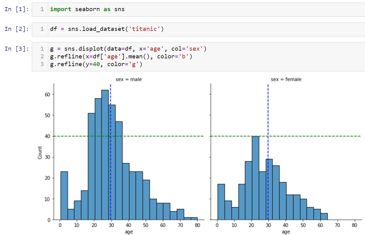
Furthermore, if you want to contribute to open source data visualization libraries (like the aforementioned), knowledge of Matplotlib will come in handy. An example is the addition of the refline() method in the Seaborn library. This method makes it possible to draw horizontal/vertical reference lines on all subplots at once. The Matplotlib methods axhline() and axvline() are the basis of this contribution:
Learning Path
- Why start with Matplotlib?
- Matplotlib basics
- Plotting with Matplotlib
Matplotlib basics
In this workshop, we will explore the static and animated visualization functionality to gain a breadth of knowledge of the library. While we won't go too in depth, additional resources will be provided throughout. Now, let's get started with the basics.

The Figure object is the container for all components of our visualization. It contains one or more Axes objects, which can be thought of as the (sub)plots, as well as other Artists, which draw on the plot canvas (x-axis, y-axis, legend, lines, etc.). The following image from the Matplotlib documentation illustrates the different components of a figure:

Matplotlib provides two main plotting interfaces:
- Functional (implicit): call functions provided by the
pyplotmodule - Object-oriented (explicit): call methods on
FigureandAxesobjects
While the object-oriented approach is encouraged by Matplotlib and highly recommended for non-interactive use (i.e., outside of a Jupyter Notebook), either approach is valid – you should, however, try to avoid mixing them. Note that different use cases lend themselves to different approaches, so we will explore examples of both in this section.
Regardless of the plotting interface we choose, we must import the pyplot module:
import matplotlib.pyplot as plt
Functional (implicit) approach
# figsize is determined by rcParams for plt.plot()
plt.plot(stackoverflow_monthly.index, stackoverflow_monthly.matplotlib)
plt.xlabel('creation date');
plt.ylabel('total questions');
plt.title('Matplotlib Questions per Month\n(since the creation of Stack Overflow)');
# plt.show() # uncomment this line if you aren't working in a notebook

Object-oriented (explicit) approach
# creates the Figure and adds a single Axes object
fig, ax = plt.subplots(figsize=(8, 2))
ax.plot(stackoverflow_monthly.index, stackoverflow_monthly.matplotlib)
ax.set_xlabel('creation date')
ax.set_ylabel('total questions')
ax.set_title('Matplotlib Questions per Month\n(since the creation of Stack Overflow)')
Text(0.5, 1.0, 'Matplotlib Questions per Month\n(since the creation of Stack Overflow)')

Tip: Take note that each of the plotting commands is returning something. These are Matplotlib objects that we can use to further customize the visualization as well.
As mentioned before, we can use Matplotlib code to modify the plot that pandas created for us. Here, we will use the object-oriented approach to remove the top and right spines and to start the y-axis at 0, while keeping the current setting for the end:
ax = stackoverflow_monthly.matplotlib.plot(
figsize=(8, 2), xlabel='creation date', ylabel='total questions',
title='Matplotlib Questions per Month\n(since the creation of Stack Overflow)'
)
ax.set_ylim(0, None) # this can also be done with pandas
# hide some of the spines (must be done with Matplotlib)
ax.spines[['top', 'right']].set_visible(False)

Tip: You can use the functional approach to change the y-axis limits by replacing ax.set_ylim(0, None) with plt.ylim(0, None).
Now that we have the basics down, let's see how to create other plot types and add additional components to them, like legends, reference lines, and annotations. Note that the anatomy of a figure diagram we looked at earlier will help moving from idea to implementation since it helps identify the right keywords to search. It may also be helpful to bookmark this Matplotlib cheat sheet.
Learning Path
- Why start with Matplotlib?
- Matplotlib basics
- Plotting with Matplotlib
Plotting with Matplotlib
Now that we understand a little bit of how Matplotlib works, we will walk through some more involved examples, which include legends, reference lines, and/or annotations, building them up step by step. Note that while using a library like pandas to do the initial plot creation can makes things easier, we will focus on using Matplotlib exclusively to get more familiar with it.
Each example in this section will showcase both how to build a specific plot with Matplotlib directly and how to customize it with some of the more advanced plotting techniques available. In particular, we will learn how to build and customize the following plot types:
- line plots
- scatter plots
- area plots
- bar plots
- stacked bar plots
- histograms
- box plots
Line plot
The Stack Overflow data we have been working with thus far is a time series, so the first set of visualizations will be for studying the evolution of the data over time. However, rather than using a monthly aggregate like before, we will use daily data, so we will read in the data once more and this time aggregate it daily:
stackoverflow_daily = pd.read_csv(
'../data/stackoverflow.zip', parse_dates=True, index_col='creation_date'
).loc[:,'pandas':'bokeh'].resample('1D').sum()
stackoverflow_daily.tail()
| pandas | matplotlib | numpy | seaborn | geopandas | geoviews | altair | yellowbrick | vega | holoviews | hvplot | bokeh | |
|---|---|---|---|---|---|---|---|---|---|---|---|---|
| creation_date | ||||||||||||
| 2021-09-08 | 132 | 33 | 49 | 5 | 2 | 0 | 2 | 1 | 1 | 1 | 0 | 2 |
| 2021-09-09 | 182 | 33 | 51 | 8 | 1 | 0 | 1 | 0 | 3 | 0 | 0 | 2 |
| 2021-09-10 | 132 | 19 | 44 | 7 | 4 | 0 | 0 | 0 | 2 | 0 | 0 | 2 |
| 2021-09-11 | 66 | 19 | 17 | 2 | 1 | 0 | 0 | 0 | 0 | 0 | 0 | 1 |
| 2021-09-12 | 69 | 14 | 24 | 3 | 0 | 1 | 0 | 0 | 0 | 0 | 0 | 0 |
We are going to visualize how the rolling 30-day mean number of Matplotlib questions changed over time, along with the standard deviation. To do so, we first need to calculate these data points using pandas:
avgs = stackoverflow_daily.rolling('30D').mean()
stds = stackoverflow_daily.rolling('30D').std()
avgs.tail()
| pandas | matplotlib | numpy | seaborn | geopandas | geoviews | altair | yellowbrick | vega | holoviews | hvplot | bokeh | |
|---|---|---|---|---|---|---|---|---|---|---|---|---|
| creation_date | ||||||||||||
| 2021-09-08 | 136.933333 | 26.966667 | 37.133333 | 5.766667 | 1.833333 | 0.000000 | 0.500000 | 0.133333 | 0.500000 | 0.400000 | 0.033333 | 1.033333 |
| 2021-09-09 | 138.000000 | 27.033333 | 37.933333 | 5.766667 | 1.833333 | 0.000000 | 0.533333 | 0.133333 | 0.566667 | 0.400000 | 0.000000 | 1.033333 |
| 2021-09-10 | 137.100000 | 26.733333 | 37.966667 | 5.800000 | 1.833333 | 0.000000 | 0.533333 | 0.133333 | 0.566667 | 0.366667 | 0.000000 | 1.066667 |
| 2021-09-11 | 133.433333 | 26.400000 | 37.233333 | 5.666667 | 1.833333 | 0.000000 | 0.533333 | 0.133333 | 0.533333 | 0.333333 | 0.000000 | 1.000000 |
| 2021-09-12 | 130.466667 | 25.933333 | 36.666667 | 5.666667 | 1.733333 | 0.033333 | 0.533333 | 0.133333 | 0.533333 | 0.233333 | 0.000000 | 0.866667 |
Now, we can proceed to building this visualization. We will work through the following steps over the next few slides:
- Create the line plot.
- Add a shaded region for $\pm$2 standard deviations from the mean.
- Set the axis labels, y-axis limits, plot title, and despine the plot.
1. Create the line plot.
By default, the plot() method will return a line plot:
fig, ax = plt.subplots(figsize=(8, 2))
ax.plot(avgs.index, avgs.matplotlib)
[<matplotlib.lines.Line2D at 0x112f0de50>]

2. Add a shaded region for $\pm$2 standard deviations from the mean.
Next, we use the fill_between() method to shade the region $\pm$2 standard deviations from the mean. Note that we also set alpha=0.25 to make the region 25% opaque – transparent enough to easily see the line for the rolling 30-day mean:
fig, ax = plt.subplots(figsize=(8, 2))
ax.plot(avgs.index, avgs.matplotlib)
ax.fill_between(
avgs.index, avgs.matplotlib - 2 * stds.matplotlib,
avgs.matplotlib + 2 * stds.matplotlib, alpha=0.25
)
<matplotlib.collections.FillBetweenPolyCollection at 0x1277f3b60>

3. Set the axis labels, y-axis limits, plot title, and despine the plot.
Now for the final touches. While in previous examples we used ax.set_xlabel(), ax.set_ylabel(), etc., here we use ax.set(), which allows us to set multiple attributes of the plot in a single method call.
fig, ax = plt.subplots(figsize=(8, 2))
ax.plot(avgs.index, avgs.matplotlib)
ax.fill_between(
avgs.index, avgs.matplotlib - 2 * stds.matplotlib,
avgs.matplotlib + 2 * stds.matplotlib, alpha=0.25
)
ax.set(
xlabel='creation date', ylabel='total questions', ylim=(0, None),
title='Rolling 30-Day Average of Matplotlib Questions per Day'
)
ax.spines[['top', 'right']].set_visible(False)

Next, we will make a utility function to remove the top and right spines of our plots more easily going forward. It's considered good practice to return the Axes object:
def despine(ax):
ax.spines[['top', 'right']].set_visible(False)
return ax
Note: Since we are working in a Jupyter Notebook, our figures are automatically closed after we run the cell. However, if you are working elsewhere, make sure to call plt.close() to free up those resources when you are finished.
Scatter plot
The plot() method can also be used to create scatter plots, but we have to pass in some additional information. Let's build up to a scatter plot of monthly Matplotlib questions with some "best fit" lines:
- Create the scatter plot.
- Convert to Matplotlib dates.
- Add the best fit lines.
- Label the axes, add a legend, and despine.
- Format both the x- and y-axis tick labels.
1. Create the scatter plot.
So far, we have passed x and y as positional arguments to the plot() method; however, there is a third argument we haven't explored: the format string (fmt) is a shorthand for specifying the marker (shape of the point), line style, and color to use for the plot. We can use this to create a scatter plot with the plot() method.
Note that while there is some flexibility in the order these are specified, it is recommended that we specify them in the following order:
fmt = '[marker][line][color]'
Here, we use the format string ok to create a scatter plot with black (k) circles (o); notice that we don't specify a line style because we don't want lines this time:
fig, ax = plt.subplots(figsize=(9, 3))
ax.plot(
stackoverflow_monthly.index,
stackoverflow_monthly.matplotlib,
'ok', label=None, alpha=0.5
)
[<matplotlib.lines.Line2D at 0x126e80190>]

Tip: As an alternative, the scatter() method can be used to create a scatter plot, in which case we don't need to specify the format string (fmt).
2. Convert to Matplotlib dates.
In the previous example, we used stackoverflow_monthly.index as our x values. While Matplotlib was able to correctly show the years on the x-axis, when we try to add the best fit lines, we will have issues. This is because Matplotlib works with dates a little differently. To get around this, we will convert the dates to Matplotlib dates while we build up the plot; then, at the end, we will format them into a human-readable format.
We can use the date2num() function in the matplotlib.dates module to convert to Matplotlib dates:
import matplotlib.dates as mdates
x_axis_dates = mdates.date2num(stackoverflow_monthly.index)
x_axis_dates[:5]
array([14152., 14183., 14213., 14244., 14275.])
Now, let's update our plot to use these dates:
fig, ax = plt.subplots(figsize=(9, 3))
ax.plot(
x_axis_dates, stackoverflow_monthly.matplotlib,
'ok', label=None, alpha=0.5
)
[<matplotlib.lines.Line2D at 0x134097b10>]

3. Add the best fit lines.
We will use NumPy to obtain the best fit lines, which will be a first degree and a second degree polynomial. The Polynomial.fit() method fits a polynomial of the specified degree to our data and returns a Polynomial instance, which we will use to obtain (x, y) points for plotting the best fit line:
import numpy as np
degree = 1
poly = np.polynomial.Polynomial.fit(
x_axis_dates, stackoverflow_monthly.matplotlib, degree
)
points = poly.linspace(n=100) # 100 evenly-spaced points along the domain
For each of these best fit lines, we will call the plot() method to add them to the scatter plot:
import numpy as np
fig, ax = plt.subplots(figsize=(9, 3))
ax.plot(x_axis_dates, stackoverflow_monthly.matplotlib, 'ok', label=None, alpha=0.5)
for degree, linestyle in zip([1, 2], ['solid', 'dashed']):
poly = np.polynomial.Polynomial.fit(
x_axis_dates, stackoverflow_monthly.matplotlib, degree
)
ax.plot(*poly.linspace(), label=degree, linestyle=linestyle, linewidth=2, alpha=0.9)

Tip: We also specified linestyle to differentiate between the lines and linewidth to make them thicker. More info on the zip() function is available here.
Before moving on, let's package up this logic in a function:
def add_best_fit_lines(ax, x, y):
for degree, linestyle in zip([1, 2], ['solid', 'dashed']):
poly = np.polynomial.Polynomial.fit(x, y, degree)
ax.plot(
*poly.linspace(),
label=degree,
linestyle=linestyle,
linewidth=2,
alpha=0.9
)
return ax
4. Label the axes, add a legend, and despine.
Next, we need to add a legend so we can tell the best fit lines apart. Now is also a good time to label our axes, give our plot a title, and adjust the limits of both the x- and y-axis (xlim/ylim). Here, we define a function that will add all of this to our plot and use the first date in the data as the start of the x-axis (we will pass this in as xmin):
def add_labels(ax, xmin):
ax.set(
xlabel='creation date', ylabel='total questions',
xlim=(xmin, None), ylim=(0, None),
title='Matplotlib Questions per Month\n(since the creation of Stack Overflow)'
)
ax.legend(title='degree') # add legend and give it a title
return ax
Let's call this after the plotting code we built up so far and also despine our plot:
fig, ax = plt.subplots(figsize=(9, 3))
ax.plot(x_axis_dates, stackoverflow_monthly.matplotlib, 'ok', label=None, alpha=0.5)
add_best_fit_lines(ax, x_axis_dates, stackoverflow_monthly.matplotlib)
add_labels(ax, x_axis_dates[0])
despine(ax)
<Axes: title={'center': 'Matplotlib Questions per Month\n(since the creation of Stack Overflow)'}, xlabel='creation date', ylabel='total questions'>

5. Format both the x- and y-axis tick labels.
All that remains now is to clean up the tick labels on the axes: the x-axis should have human-readable dates, and the y-axis can be improved by formatting the numbers for readability. For both, we will need to access the Axis objects contained in the Axes object via the xaxis/yaxis attribute:
ax.xaxis # access the x-axis
ax.yaxis # access the y-axis
From there, we will use two methods to customize the major tick labels (as opposed to minor, which our plot isn't currently showing). We call the set_major_locator() method to adjust where the ticks are located, and the set_major_formatter() to adjust the format of the tick labels. For the x-axis, we will place ticks at 16-month intervals and format the labels as %b\n%Y, which places the month abbreviation above the year. This functionality comes from the matplotlib.dates module:
ax.xaxis.set_major_locator(mdates.MonthLocator(interval=16))
ax.xaxis.set_major_formatter(mdates.DateFormatter('%b\n%Y'))
The matplotlib.ticker module contains classes for tick location and formatting for non-dates. Here, we use the StrMethodFormatter class to provide a format string just as we would see with the str.format() method. This particular format specifies that the labels should be floats with commas as the thousands separator and zero digits after the decimal:
from matplotlib import ticker
ax.yaxis.set_major_formatter(ticker.StrMethodFormatter('{x:,.0f}'))
Now, let's put everything together in a function:
from matplotlib import ticker
def format_axes(ax):
ax.xaxis.set_major_locator(mdates.MonthLocator(interval=16))
ax.xaxis.set_major_formatter(mdates.DateFormatter('%b\n%Y'))
ax.yaxis.set_major_formatter(ticker.StrMethodFormatter('{x:,.0f}'))
return ax
Tip: Use EngFormatter instead of StrMethodFormatter for engineering notation.
We now have all the pieces for our final visualization:
fig, ax = plt.subplots(figsize=(9, 3))
ax.plot(x_axis_dates, stackoverflow_monthly.matplotlib, 'ok', label=None, alpha=0.5)
add_best_fit_lines(ax, x_axis_dates, stackoverflow_monthly.matplotlib)
add_labels(ax, x_axis_dates[0])
despine(ax)
format_axes(ax)
<Axes: title={'center': 'Matplotlib Questions per Month\n(since the creation of Stack Overflow)'}, xlabel='creation date', ylabel='total questions'>

Solution
We start by reading in the dataset:
import pandas as pd
weather = pd.read_csv('../data/weather.csv', parse_dates=True, index_col='date')
weather.head()
| city | AWND | PRCP | SNOW | TAVG | TMAX | TMIN | |
|---|---|---|---|---|---|---|---|
| date | |||||||
| 2020-01-01 | Atlanta | 7.2 | 0.0 | 0.0 | 45.0 | 57.0 | 36.0 |
| 2020-01-01 | Boston | 15.4 | 0.0 | 0.0 | 39.0 | 43.0 | 36.0 |
| 2020-01-01 | Chicago | 11.9 | 0.0 | 0.0 | 28.0 | 42.0 | 21.0 |
| 2020-01-01 | Honolulu | 6.3 | 0.0 | NaN | 76.0 | 81.0 | 68.0 |
| 2020-01-01 | Houston | 6.5 | 0.1 | 0.0 | 52.0 | 60.0 | 47.0 |
Next, we create a function to generate the desired plot:
import matplotlib.dates as mdates
import matplotlib.pyplot as plt
from utils import despine
def solution(data):
la_tavg = data.query('city == "LA"').TAVG
nyc_tavg = data.query('city == "NYC"').TAVG
fig, ax = plt.subplots(figsize=(8, 3))
ax.plot(la_tavg.index, la_tavg, label='LA')
ax.plot(nyc_tavg.index, nyc_tavg, label='NYC')
ax.set(
title='Average Daily Temperatures', xlim=(la_tavg.index.min(), None),
ylabel=r'temperature ($^\circ$F)'
)
ax.xaxis.set_major_formatter(mdates.DateFormatter('%b\n%Y'))
ax.fill_between(
la_tavg.index, la_tavg, nyc_tavg, where=nyc_tavg > la_tavg,
hatch='///', facecolor='gray', alpha=0.5, label='NYC hotter than LA'
)
ax.legend(ncols=3, loc='lower center')
return despine(ax)
Finally, we call the solution() function passing in the weather data:
solution(weather)
<Axes: title={'center': 'Average Daily Temperatures'}, ylabel='temperature ($^\\circ$F)'>

Note: You can use $LaTeX$ symbols when providing text (annotations, titles, etc.) to Matplotlib commands, e.g., using r'$\alpha$' will be rendered as $\alpha$. See this page in the documentation for more information.
Area plot
We have just been using the Matplotlib questions time series, but it's also interesting to look at trends for multiple libraries. Since the libraries in this dataset vary in age, popularity, and number of Stack Overflow questions, a good option to view many at once is an area plot. This will give us an idea of both the overall trend for these types of libraries and the libraries themselves. Let's start by subsetting our daily Stack Overflow questions data to the top four libraries by number of questions:
subset = stackoverflow_daily.sum().nlargest(4)
top_libraries_monthly = stackoverflow_monthly.reindex(columns=subset.index)
top_libraries_monthly.head()
| pandas | numpy | matplotlib | seaborn | |
|---|---|---|---|---|
| creation_date | ||||
| 2008-09-30 | 0 | 3 | 2 | 0 |
| 2008-10-31 | 0 | 2 | 0 | 0 |
| 2008-11-30 | 0 | 3 | 0 | 0 |
| 2008-12-31 | 0 | 4 | 2 | 0 |
| 2009-01-31 | 0 | 7 | 1 | 0 |
Now, we can build up our plot. Once again, we will break this down in steps:
- Create the area plot.
- Label and format the axes, provide a title, and despine the plot.
- Add annotations.
1. Create the area plot.
First, we use stackplot() to create the area plot as our starting point. Note that we are using Matplotlib dates from the start rather than switching when we add the annotations:
fig, ax = plt.subplots(figsize=(12, 3))
ax.stackplot(
mdates.date2num(top_libraries_monthly.index),
top_libraries_monthly.to_numpy().T, # each element is a library's time series
labels=top_libraries_monthly.columns
)
[<matplotlib.collections.FillBetweenPolyCollection at 0x12548d090>, <matplotlib.collections.FillBetweenPolyCollection at 0x12548d1d0>, <matplotlib.collections.FillBetweenPolyCollection at 0x12548d310>, <matplotlib.collections.FillBetweenPolyCollection at 0x12548d450>]

2. Label and format the axes, provide a title, and despine the plot.
Next, we will handle labels and formatting before working on the annotations. This should look familiar from previous examples:
fig, ax = plt.subplots(figsize=(12, 3))
ax.stackplot(
mdates.date2num(top_libraries_monthly.index), top_libraries_monthly.to_numpy().T,
labels=top_libraries_monthly.columns
)
ax.set(xlabel='', ylabel='tagged questions', title='Stack Overflow Questions per Month')
ax.xaxis.set_major_formatter(mdates.DateFormatter('%Y'))
ax.yaxis.set_major_formatter(ticker.EngFormatter())
despine(ax)
<Axes: title={'center': 'Stack Overflow Questions per Month'}, ylabel='tagged questions'>

This will be the basis of a couple of visualizations we do in this section, so let's make a function for what we have so far:
def area_plot(data):
fig, ax = plt.subplots(figsize=(12, 3))
ax.stackplot(
mdates.date2num(data.index),
data.to_numpy().T,
labels=data.columns
)
ax.set(
xlabel='', ylabel='tagged questions',
title='Stack Overflow Questions per Month'
)
ax.xaxis.set_major_formatter(mdates.DateFormatter('%Y'))
ax.yaxis.set_major_formatter(ticker.EngFormatter())
despine(ax)
return ax
3. Add annotations.
Rather than use a legend for this plot, we are going to use annotations to label each area and provide the median value in 2021. To create annotations, we use the annotate() method with the following arguments:
- The first argument (
text) is the annotation text as a string. - The
xyargument is a tuple of the coordinates for the data point that we are annotating. - The
xytextargument is a tuple of the coordinates where we want to place the annotation text. - When providing
xytext, we can optionally providearrowprops, which defines the style to use for the arrow pointing fromxytexttoxy. - We can also customize alignment of the text horizontally (
ha) and vertically (va).
We will annotate pandas, NumPy, and Matplotlib alongside their respective areas, but Seaborn will be moved higher up and to the right using an arrow to point to its area (since it is thin). Once again, we will place this logic in a function for reuse later:
def annotate(ax, data):
total = 0
last_day = data.index.max()
for area in ax.collections:
library = area.get_label()
last_value = data.loc[last_day, library]
if library != 'seaborn':
kwargs = {}
else:
kwargs = dict(
xytext=(last_day + pd.Timedelta(days=20), (last_value + total) * 1.1),
arrowprops=dict(arrowstyle='->')
)
ax.annotate(
f' {library}: {data.loc["2021", library].median():,.0f}',
xy=(last_day, last_value / 2 + total), ha='left', va='center', **kwargs
)
total += last_value
return ax
Now, let's see what our plot looks like so far:
ax = area_plot(top_libraries_monthly)
annotate(ax, top_libraries_monthly)
<Axes: title={'center': 'Stack Overflow Questions per Month'}, ylabel='tagged questions'>

Before we move on to our next plot, which builds upon this one, let's update our area_plot() function to include the call to the annotate() function:
def area_plot(data):
fig, ax = plt.subplots(figsize=(12, 3))
ax.stackplot(
mdates.date2num(data.index),
data.to_numpy().T,
labels=data.columns
)
ax.set(
xlabel='', ylabel='tagged questions',
title='Stack Overflow Questions per Month'
)
ax.xaxis.set_major_formatter(mdates.DateFormatter('%Y'))
ax.yaxis.set_major_formatter(ticker.EngFormatter())
despine(ax)
annotate(ax, data)
return ax
More Annotations
The Stack Overflow community is very active, and you will frequently see old questions updated with new answers reflecting the latest solutions. The dataset we have been working with contains several examples of this: Seaborn makes some plotting tasks a lot easier than Matplotlib, so some of the Stack Overflow questions that are currently tagged "seaborn" were originally posted before Seaborn's first release (v0.1) on October 28, 2013. See the Color by Column Values in Matplotlib question for an example.
Let's use reference lines and a shaded region to highlight this section on the area plot.
First, we will add a dashed vertical line for Seaborn's first release (October 28, 2013) using the axvline() method:
import datetime as dt
ax = area_plot(top_libraries_monthly)
# mark when seaborn was created
seaborn_released = dt.date(2013, 10, 28)
ax.axvline(seaborn_released, ymax=0.6, color='gray', linestyle='dashed')
ax.annotate('seaborn v0.1', xy=(seaborn_released, 4750), rotation=-90, va='top')
Text(2013-10-28, 4750, 'seaborn v0.1')

Next, we'll make an additional vertical line for the oldest question that was retroactively tagged "seaborn":
ax = area_plot(top_libraries_monthly)
seaborn_released = dt.date(2013, 10, 28)
ax.axvline(seaborn_released, ymax=0.6, color='gray', linestyle='dashed')
ax.annotate('seaborn v0.1', xy=(seaborn_released, 4750), rotation=-90, va='top')
# oldest question tagged "seaborn"
first_seaborn_qs = top_libraries_monthly.query('seaborn >= 1')\
.index[0].to_pydatetime().date()
ax.axvline(first_seaborn_qs, ymax=0.6, color='gray', linestyle='dashed')
<matplotlib.lines.Line2D at 0x133d5fb10>

Let's package this reference line logic up in a function before looking at how to shade the region between them:
def add_reflines(ax, data):
seaborn_released = dt.date(2013, 10, 28)
ax.axvline(seaborn_released, ymax=0.6, color='gray', linestyle='dashed')
ax.annotate('seaborn v0.1', xy=(seaborn_released, 4750), rotation=-90, va='top')
first_seaborn_qs = \
data.query('seaborn >= 1').index[0].to_pydatetime().date()
ax.axvline(first_seaborn_qs, ymax=0.6, color='gray', linestyle='dashed')
return ax
Finally, we use the axvspan() method to shade in the region between the lines:
ax = area_plot(top_libraries_monthly)
add_reflines(ax, top_libraries_monthly)
# shade the region of posts that were retroactively tagged "seaborn"
ax.axvspan(
ymax=0.6, xmin=mdates.date2num(first_seaborn_qs),
xmax=mdates.date2num(seaborn_released), color='gray', alpha=0.25
)
middle = (seaborn_released - first_seaborn_qs) / 2 + first_seaborn_qs
ax.annotate(
'posts retroactively\ntagged "seaborn"',
xy=(mdates.date2num(middle), 3500),
va='top', ha='center'
)
Text(15505.0, 3500, 'posts retroactively\ntagged "seaborn"')

1. Add the inset Axes object to the Figure object.
First, we need to modify our area_plot() function to return the Figure object as well:
def area_plot(data):
fig, ax = plt.subplots(figsize=(12, 3))
ax.stackplot(
mdates.date2num(data.index),
data.to_numpy().T,
labels=data.columns
)
ax.set(
xlabel='', ylabel='tagged questions',
title='Stack Overflow Questions per Month'
)
ax.xaxis.set_major_formatter(mdates.DateFormatter('%Y'))
ax.yaxis.set_major_formatter(ticker.EngFormatter())
despine(ax)
annotate(ax, data)
return fig, ax
Now, we can call our updated area_plot() function and use the Figure object that it returns to add the inset plot via the add_axes() method. This method receives the dimensions as a sequence of 4 values, represented as percentages of Figure dimensions:
left: Offset from the left edge of theFigure(i.e., thex).bottom: Offset from the bottom edge of theFigure(i.e., they).width: The width of the inset.height: The height of the inset.
fig, ax = area_plot(top_libraries_monthly)
inset_ax = fig.add_axes([0.2, 0.6, 0.2, 0.2])

Tip: Check out the axes_grid1 toolkit if you want the inset to contain a "zoomed in" version of the data.
2. Create the horizontal bar plot.
Next, we use the barh() method to add horizontal bars to the inset. These bars will represent total questions for each of the libraries in the area plot, so we will also need to make sure the colors align. For this, we use the collections attribute to access each of the sections of the area plot and grab their colors with the get_facecolor() method:
fig, ax = area_plot(top_libraries_monthly)
inset_ax = fig.add_axes([0.2, 0.6, 0.2, 0.2])
colors = {area.get_label(): area.get_facecolor() for area in ax.collections}
# populate the inset with a bar plot of total questions
total_qs = top_libraries_monthly.sum()
inset_ax.barh(
total_qs.index, total_qs.to_numpy(),
color=[colors[label] for label in total_qs.index]
)
inset_ax.yaxis.set_inverted(True) # sort bars in descending order

3. Label and format the plot.
Labeling and formatting the inset works the same as we've seen before:
fig, ax = area_plot(top_libraries_monthly)
inset_ax = fig.add_axes([0.2, 0.6, 0.2, 0.2])
colors = {area.get_label(): area.get_facecolor() for area in ax.collections}
total_qs = top_libraries_monthly.sum()
inset_ax.barh(
total_qs.index, total_qs.to_numpy(),
color=[colors[label] for label in total_qs.index]
)
inset_ax.yaxis.set_inverted(True)
despine(inset_ax)
inset_ax.xaxis.set_major_formatter(ticker.EngFormatter())
inset_ax.set_xlabel('total questions')
Text(0.5, 0, 'total questions')

Final remarks on this example:
- More complicated subplot layouts can be created with GridSpec or the Figure.subplot_mosaic() method, which was added in v3.3 to make it easier to create complex layouts.
- We used both dictionary and list comprehensions here – check out this article for more information on comprehensions in Python.
Annotating bars
Our inset only shows data for four of the libraries in the Stack Overflow dataset to match the area plot. Due to the smaller scale of the other libraries, it didn't make sense to include them in the area plot; however, we can visualize total questions for each of them with a bar plot if we use a log scale for the x-axis. This time our bar plot won't just be an inset, and we will explore how to annotate the bars.
Our data looks like this:
questions_per_library = pd.read_csv(
'../data/stackoverflow.zip', parse_dates=True, index_col='creation_date'
).loc[:,'pandas':'bokeh'].sum().sort_values()
questions_per_library
yellowbrick 54 geoviews 63 hvplot 92 holoviews 542 vega 598 altair 804 geopandas 1652 bokeh 4386 seaborn 7414 matplotlib 60554 numpy 93797 pandas 214919 dtype: int64
We will work through the following steps to create this visualization:
- Create the bar plot.
- Label, format, and apply a log scale to the plot.
- Annotate each of the bars.
1. Create the bar plot.
We once again use the barh() method to create horizontal bars; however, note that the bar() method can be used to create vertical bars:
fig, ax = plt.subplots(figsize=(7, 4))
ax.barh(questions_per_library.index, questions_per_library.to_numpy())
<BarContainer object of 12 artists>

2. Label, format, and apply a log scale to the plot.
To change the scale of an axis, we specify a value for xscale/yscale or pass in a value to the set_xscale()/set_yscale() method:
ax.set_xscale('log')
ax.set(xscale='log')
Now, we can actually see all the bars:
fig, ax = plt.subplots(figsize=(7, 4))
ax.barh(questions_per_library.index, questions_per_library.to_numpy())
ax.set(xlabel='total questions', xscale='log')
despine(ax)
<Axes: xlabel='total questions'>

3. Annotate each of the bars.
To annotate the bars, we need to grab them off the Axes object, similar to how we grabbed the colors from the area plot. To access the bars, we use the patches attribute. Here, we write a function to iterate over each of these patches and annotate each bar with the total number of questions for that library:
def annotate_bars(ax):
for bar in ax.patches:
x, y = bar.get_xy()
ax.text(
x + bar.get_width(), y + bar.get_height()/2, f'{bar.get_width():,d} ',
va='center', ha='right', color='white'
)
return ax
Putting everything together, our final visualization looks like this:
fig, ax = plt.subplots(figsize=(7, 4))
ax.barh(questions_per_library.index, questions_per_library.to_numpy())
ax.set(xlabel='total questions', xscale='log')
despine(ax)
annotate_bars(ax)
<Axes: xlabel='total questions'>

Solution
We start by calculating the monthly precipitation for Seattle:
import pandas as pd
weather = pd.read_csv('../data/weather.csv', parse_dates=True, index_col='date')
monthly_seattle_prcp = weather.query('city == "Seattle"').resample('1MS').PRCP.sum()
monthly_seattle_prcp.head()
date 2020-01-01 9.17 2020-02-01 4.05 2020-03-01 3.17 2020-04-01 1.70 2020-05-01 3.11 Freq: MS, Name: PRCP, dtype: float64
Next, we create a function to generate the desired plot:
import matplotlib.dates as mdates
import matplotlib.pyplot as plt
from utils import despine
def solution(data):
fig, ax = plt.subplots(figsize=(7, 3))
ax.bar(data.index, data.to_numpy(), width=20)
for bar in ax.patches:
x, y = bar.get_xy()
ax.text(
x + bar.get_width()/2, y + bar.get_height(), f'{bar.get_height():.1f}',
va='bottom', ha='center', color='black'
)
ax.set(title='Seattle Monthly Precipitation', ylabel='total precipitation (inches)')
ax.xaxis.set_major_locator(mdates.MonthLocator())
ax.xaxis.set_major_formatter(mdates.DateFormatter('%b\n%Y'))
return despine(ax)
Finally, we call the solution() function passing in the monthly Seattle precipitation data:
solution(monthly_seattle_prcp)
<Axes: title={'center': 'Seattle Monthly Precipitation'}, ylabel='total precipitation (inches)'>

Our data looks as follows. Here, we see that the largest co-occurrence with hvplot is holoviews followed by bokeh.
co_occur = pd.read_csv(
'../data/stackoverflow_tag_co_occurrences.csv',
index_col='library'
)
co_occur.style.background_gradient(axis=None, vmin=0, vmax=1)
| hvplot | geoviews | seaborn | holoviews | geopandas | matplotlib | numpy | bokeh | pandas | |
|---|---|---|---|---|---|---|---|---|---|
| library | |||||||||
| hvplot | 0.000000 | 0.032609 | 0.021739 | 0.539855 | 0.048913 | 0.023551 | 0.000000 | 0.110507 | 0.103261 |
| geoviews | 0.047619 | 0.000000 | 0.000000 | 0.431217 | 0.058201 | 0.039683 | 0.007937 | 0.140212 | 0.084656 |
| seaborn | 0.000270 | 0.000000 | 0.000000 | 0.000135 | 0.000607 | 0.468033 | 0.015871 | 0.002001 | 0.230780 |
| holoviews | 0.091636 | 0.050123 | 0.001845 | 0.000000 | 0.003075 | 0.030750 | 0.010148 | 0.371771 | 0.066113 |
| geopandas | 0.002724 | 0.002220 | 0.002724 | 0.001009 | 0.000000 | 0.118644 | 0.009988 | 0.011703 | 0.250504 |
| matplotlib | 0.000036 | 0.000041 | 0.057304 | 0.000275 | 0.003237 | 0.000000 | 0.087198 | 0.001594 | 0.135548 |
| numpy | 0.000000 | 0.000005 | 0.001254 | 0.000059 | 0.000176 | 0.056294 | 0.000000 | 0.000144 | 0.167267 |
| bokeh | 0.002318 | 0.002014 | 0.003382 | 0.045942 | 0.004408 | 0.022002 | 0.003078 | 0.000000 | 0.087855 |
| pandas | 0.000044 | 0.000025 | 0.007961 | 0.000167 | 0.001926 | 0.038191 | 0.073000 | 0.001793 | 0.000000 |
Tip: For more on styling DataFrames, check out the pandas documentation here.
Note that the diagonal contains all zeros because we also want to understand what percentage of questions per library were also tagged with another library in this dataset. For example, most questions tagged with hvplot or geoviews were also tagged with another library in our list, but questions tagged with pandas were only tagged with another library 12.3% of the time:
co_occur.sum(axis=1)
library hvplot 0.880435 geoviews 0.809524 seaborn 0.717696 holoviews 0.625461 geopandas 0.399516 matplotlib 0.285233 numpy 0.225199 bokeh 0.170999 pandas 0.123107 dtype: float64
In this example, we will also see another way of formatting an axis with ticker and learn how to customize colors. Let's work through the following steps:
- Create the stacked bar plot.
- Add the legend.
- Label and format the plot.
- Annotate the bars.
- Change the color scheme.
1. Create the stacked bar plot.
To make our stacked bar plot, we can still use the barh() method; however, we have to make multiple calls to it, each time specifying where the starting point should be (i.e., the end of the previous portion of the bar). We will package this logic up in a function:
def stacked_bars(data):
fig, ax = plt.subplots(figsize=(6, 3))
libraries = data.index
last = 0
for library in libraries:
co_occurring_library = data[library]
ax.barh(libraries, co_occurring_library, label=library, left=last)
last += co_occurring_library
ax.yaxis.set_inverted(True)
return despine(ax)
Calling our function gives us the start of our stacked bar plot visualization:
ax = stacked_bars(co_occur)

2. Add the legend.
Next, we add a legend to understand what the colors mean:
ax = stacked_bars(co_occur)
ax.legend(bbox_to_anchor=(1.35, 0.5), loc='center right', framealpha=0.5)
<matplotlib.legend.Legend at 0x1252cdf90>

3. Label and format the plot.
Then, we label our x-axis and set the limits of the x-axis (xlim) so that it goes from 0% to 100%. We also use ticker.PercentFormatter to display our x-axis tick labels as percentages. Note that we passed in xmax=1 when instantiating it because our data already contains percentages, but passing in the maximum value in the data will calculate the percentages:
ax = stacked_bars(co_occur)
ax.legend(bbox_to_anchor=(1.35, 0.5), loc='center right', framealpha=0.5)
ax.set(xlabel='percentage of questions with co-occurrences', xlim=(0, 1))
ax.xaxis.set_major_formatter(ticker.PercentFormatter(xmax=1))

Before moving on, let's update our function to include what we have so far:
def stacked_bars(data):
fig, ax = plt.subplots(figsize=(6, 3))
libraries = data.index
last = 0
for library in libraries:
co_occurring_library = data[library]
ax.barh(libraries, co_occurring_library, label=library, left=last)
last += co_occurring_library
ax.yaxis.set_inverted(True)
ax.legend(bbox_to_anchor=(1.35, 0.5), loc='center right', framealpha=0.5)
ax.set(xlabel='percentage of questions with co-occurrences', xlim=(0, 1))
ax.xaxis.set_major_formatter(ticker.PercentFormatter(xmax=1))
return despine(ax)
4. Annotate the bars.
As with the previous example, we annotate our bars after accessing each via the patches attribute on the Axes object. However, this time we only label bars whose values surpass a threshold – note that the value of a bar here is its width:
ax = stacked_bars(co_occur)
for patch in ax.patches:
width = patch.get_width()
if width > .09:
ax.text(
patch.get_x() + width/2, patch.get_y() + patch.get_height()/2,
f'{width:.1%}', va='center', ha='center', color='ivory', fontsize=11
)

Let's package up the annotation logic before moving on:
def annotate_bars(ax, threshold):
for patch in ax.patches:
width = patch.get_width()
if width > threshold:
ax.text(
patch.get_x() + width/2, patch.get_y() + patch.get_height()/2,
f'{width:.1%}', va='center', ha='center', color='ivory', fontsize=11
)
return ax
5. Change the color scheme.
Throughout this workshop, we have been using default colormaps. For this visualization, we will take a look at how to change the colormap. Note that this is only one way of working with colormaps.
For this example, we will select the tab10 qualitative colormap and reverse its order:
import matplotlib as mpl
cmap = mpl.colormaps['tab10'].reversed()
Note: The colormap we selected is the default colormap, but reversing it will change the order in which the colors are assigned. Since we have nine elements and ten colors, we will see a new color this time. Check out the full list of colormaps here.
The colormap object is a callable:
[cmap(i) for i in range(2)]
[(np.float64(0.09019607843137255), np.float64(0.7450980392156863), np.float64(0.8117647058823529), np.float64(1.0)), (np.float64(0.7372549019607844), np.float64(0.7411764705882353), np.float64(0.13333333333333333), np.float64(1.0))]
Tip: Learn more about callables here.
This means that when we update our stacked_bars() function to accept a colormap, we also need to update our for loop:
def stacked_bars(data, cmap):
fig, ax = plt.subplots(figsize=(6, 3))
libraries = data.index
last = 0
for i, library in enumerate(libraries):
co_occurring_library = data[library]
ax.barh(
libraries, co_occurring_library,
label=library, left=last, color=cmap(i)
)
last += co_occurring_library
ax.yaxis.set_inverted(True)
ax.legend(bbox_to_anchor=(1.35, 0.5), loc='center right', framealpha=0.5)
ax.set(xlabel='percentage of questions with co-occurrences', xlim=(0, 1))
ax.xaxis.set_major_formatter(ticker.PercentFormatter(xmax=1))
return despine(ax)
Calling the updated function with the reversed colormap changes the colors on each of the bars:
ax = stacked_bars(co_occur, cmap)
annotate_bars(ax, threshold=0.09)
<Axes: xlabel='percentage of questions with co-occurrences'>

Tip: The full list of colors Matplotlib recognizes by name can be found here.
Solution
We start by calculating the total precipitation per city per quarter:
import pandas as pd
weather = pd.read_csv('../data/weather.csv', parse_dates=True, index_col='date')
quarterly_prcp = weather.pivot(columns='city', values='PRCP').resample('QE').sum()
quarterly_prcp
| city | Atlanta | Boston | Chicago | Honolulu | Houston | LA | Miami | NYC | Phoenix | SF | Seattle |
|---|---|---|---|---|---|---|---|---|---|---|---|
| date | |||||||||||
| 2020-03-31 | 26.04 | 8.29 | 7.03 | 5.75 | 7.70 | 4.49 | 5.03 | 8.25 | 3.47 | 2.35 | 16.39 |
| 2020-06-30 | 11.48 | 8.96 | 16.96 | 3.20 | 14.08 | 2.80 | 26.71 | 6.50 | 0.00 | 1.61 | 7.07 |
| 2020-09-30 | 14.69 | 5.13 | 5.60 | 0.99 | 13.00 | 0.00 | 24.56 | 13.81 | 0.10 | 0.05 | 2.82 |
| 2020-12-31 | 12.56 | 13.94 | 7.27 | 3.51 | 7.25 | 1.75 | 22.73 | 11.50 | 0.44 | 1.56 | 11.74 |
Next, we create a function to generate the desired plot:
import matplotlib.pyplot as plt
from utils import despine
def solution(data):
fig, ax = plt.subplots(figsize=(6, 3))
total_prcp = data.sum().sort_values()
sort_order = total_prcp.index
last = 0
for quarter_end in data.index:
prcp = data.loc[quarter_end, sort_order]
ax.barh(
sort_order, prcp, label=f'Q{quarter_end.quarter}',
left=last, alpha=0.8
)
last += prcp
ax.set_xlabel('2020 total precipitation (inches)')
ax.set_title('Total Precipitation per City in 2020', y=1.1)
ax.axvline(total_prcp['Seattle'], linestyle='--', color='gray')
ax.legend(bbox_to_anchor=(0.5, 1.15), loc='upper center', ncols=4, frameon=False)
return despine(ax)
Finally, we call the solution() function passing in the quarterly precipitation data:
solution(quarterly_prcp)
<Axes: title={'center': 'Total Precipitation per City in 2020'}, xlabel='2020 total precipitation (inches)'>

Histogram
We will now be switching to a different dataset for the final two plot types that we will be discussing. The new dataset we will be working with contains NYC subway entrances and exits per borough per day for 2017-2021. It was resampled from this Kaggle dataset created through some extensive data wrangling by Kaggle user Edden. Our dataset looks like this:
subway = pd.read_csv(
'../data/NYC_subway_daily.csv', parse_dates=['Datetime'],
index_col=['Borough', 'Datetime']
)
subway_daily = subway.unstack(0)
subway_daily.head()
| Entries | Exits | |||||||
|---|---|---|---|---|---|---|---|---|
| Borough | Bk | Bx | M | Q | Bk | Bx | M | Q |
| Datetime | ||||||||
| 2017-02-04 | 617650.0 | 247539.0 | 1390496.0 | 408736.0 | 417449.0 | 148237.0 | 1225689.0 | 279699.0 |
| 2017-02-05 | 542667.0 | 199078.0 | 1232537.0 | 339716.0 | 405607.0 | 139856.0 | 1033610.0 | 268626.0 |
| 2017-02-06 | 1184916.0 | 472846.0 | 2774016.0 | 787206.0 | 761166.0 | 267991.0 | 2240027.0 | 537780.0 |
| 2017-02-07 | 1192638.0 | 470573.0 | 2892462.0 | 790557.0 | 763653.0 | 270007.0 | 2325024.0 | 544828.0 |
| 2017-02-08 | 1243658.0 | 497412.0 | 2998897.0 | 825679.0 | 788356.0 | 275695.0 | 2389534.0 | 559639.0 |
We will build a histogram of daily subway entries in Manhattan with this data using the following steps:
- Create the histogram.
- Label and format the plot.
- Explore the use of subplots.
- Apply a style sheet.
1. Create the histogram.
To create a histogram, we use the hist() method:
fig, ax = plt.subplots(figsize=(6, 3))
ax.hist(subway_daily.loc['2018', 'Entries']['M'], ec='black')
(array([ 4., 35., 40., 34., 4., 3., 7., 32., 98., 108.]),
array([ 857859. , 1087318.1, 1316777.2, 1546236.3, 1775695.4, 2005154.5,
2234613.6, 2464072.7, 2693531.8, 2922990.9, 3152450. ]),
<BarContainer object of 10 artists>)

2. Label and format the plot.
Next, we clean up the plot by labeling axes and formatting the tick labels:
fig, ax = plt.subplots(figsize=(6, 3))
ax.hist(subway_daily.loc['2018', 'Entries']['M'], ec='black')
ax.set(
xlabel='Entries', ylabel='Frequency',
title='Histogram of Daily Subway Entries in Manhattan'
)
ax.xaxis.set_major_formatter(ticker.EngFormatter())
despine(ax)
<Axes: title={'center': 'Histogram of Daily Subway Entries in Manhattan'}, xlabel='Entries', ylabel='Frequency'>

3. Explore the use of subplots.
The histogram of daily subway entries in Manhattan shows a distribution that is clearly bimodal. Let's use subplots to separate out the weekday and weekend distributions that combine to form the shape that we are seeing.
First, we will need to create a Boolean mask to be able to filter our data by weekday versus weekend:
weekday_mask = subway_daily.index.weekday < 5
weekday_mask
array([False, False, True, ..., True, True, True], shape=(1652,))
Next, we will need to update our call to plt.subplots() to specify one row of two columns as our layout, with all subplots sharing the same x-axis range (sharex=True). Since there are fewer weekend days than weekdays in the year, we don't share the y-axis (sharey=False). As before, we call the hist() method to add the histogram to each of the subplots:
fig, axes = plt.subplots(1, 2, figsize=(8, 3), sharex=True, sharey=False)
for ax, mask in zip(axes, [~weekday_mask, weekday_mask]):
ax.hist(subway_daily[mask].loc['2018', 'Entries']['M'], ec='black')

Tip: When iterating over layouts with multiple rows and columns (e.g., a 2x2 layout), call the flatten() method on the NumPy ndarray of Axes objects to iterate over the Axes objects one by one rather than row by row.
Now, let's label and format the subplots. We will use the x-axis label to distinguish between the weekday and weekend distributions, and we will only provide a label for the y-axis of the leftmost plot to reduce clutter. This requires that we include a label in our for loop. Here, we are also updating the x-axis tick label format to use engineering notation:
fig, axes = plt.subplots(1, 2, figsize=(8, 3), sharex=True, sharey=False)
for ax, mask, label in zip(axes, [~weekday_mask, weekday_mask], ['Weekend', 'Weekday']):
ax.hist(subway_daily[mask].loc['2018', 'Entries']['M'], ec='black')
ax.set_xlabel(f'Entries per {label}')
ax.xaxis.set_major_formatter(ticker.EngFormatter())
despine(ax)
axes[0].set_ylabel('Frequency')
Text(0, 0.5, 'Frequency')

Since we have multiple subplots, we need to call the suptitle() method on the Figure object to provide a title for the whole visualization. This shows the clear shift in subway usage between weekdays and weekends, along with the effect of the bridge-and-tunnel crowd:
fig, axes = plt.subplots(1, 2, figsize=(8, 3), sharex=True, sharey=False)
for ax, mask, label in zip(axes, [~weekday_mask, weekday_mask], ['Weekend', 'Weekday']):
ax.hist(subway_daily[mask].loc['2018', 'Entries']['M'], ec='black')
ax.set_xlabel(f'Entries per {label}')
ax.xaxis.set_major_formatter(ticker.EngFormatter())
despine(ax)
axes[0].set_ylabel('Frequency')
fig.suptitle('Histogram of Daily Subway Entries in Manhattan')
Text(0.5, 0.98, 'Histogram of Daily Subway Entries in Manhattan')

Before moving on, let's package up this code in a function. Note that we are removing the call to despine() since the style sheet we will use next already hides the spines:
def subway_histogram(subway_daily, weekday_mask):
fig, axes = plt.subplots(1, 2, figsize=(8, 3), sharex=True, sharey=False)
for ax, mask, label in zip(
axes, [~weekday_mask, weekday_mask], ['Weekend', 'Weekday']
):
ax.hist(subway_daily[mask].loc['2018', 'Entries']['M'], ec='black')
ax.set_xlabel(f'Entries per {label}')
ax.xaxis.set_major_formatter(ticker.EngFormatter())
axes[0].set_ylabel('Frequency')
fig.suptitle('Histogram of Daily Subway Entries in Manhattan')
return fig, axes
4. Apply a style sheet.
Matplotlib comes with a variety of style sheets that make it simple to customize a bunch of settings at once. We can activate a style sheet for a single plot using the plt.style.context() context manager. Here, we apply the seaborn-v0_8-darkgrid style sheet. Notice that with this style sheet, it's a little hard to tell where the ticks are on the x-axis for the regions populated with bars (for example, 1.5 M on the left plot):
with plt.style.context('seaborn-v0_8-darkgrid'):
subway_histogram(subway_daily, weekday_mask)

We can make the ticks more visible with some additional styling. For this to be easily reproducible, we will make our edits in a new style sheet with the .mplstyle file extension. Each line of the file will be a key-value pair targeting a style setting:
with open('../style_tweaks.mplstyle', 'r') as style_sheet:
print(style_sheet.read())
xtick.major.size: 3 ytick.major.size: 3
Tip: The possible keys for the style sheet come from rcParams. Check out the documentation here for a listing of possible values or use plt.rcParams.find_all() to search by pattern.
Combining style sheets works just like CSS, with later styles (further to the right in the list) taking precedence over earlier styles (further to the left in the list) in the case of overlap. This time, we pass a list to plt.style.context() and make sure our style tweaks are last:
with plt.style.context(['seaborn-v0_8-darkgrid', '../style_tweaks.mplstyle']):
subway_histogram(subway_daily, weekday_mask)

Tip: To set one-off options without creating a style sheet, use the plt.rc_context() context manager.
Box plot
As an alternative to the previous visualization, we will create box plots. Our initial code looks very similar – we just call the boxplot() method instead of the hist() method:
fig, axes = plt.subplots(1, 2, figsize=(6, 2.5), sharey=True)
for ax, mask, label in zip(axes, [~weekday_mask, weekday_mask], ['Weekend', 'Weekday']):
ax.boxplot(subway_daily[mask].loc['2018', 'Entries']['M'])
ax.set_xlabel(label)
ax.yaxis.set_major_formatter(ticker.EngFormatter())
despine(ax)
axes[0].set_ylabel('daily subway entries')
fig.suptitle('Box Plot of Daily Subway Entries in Manhattan');

However, this time each of the subplots has a single tick with the label 1. Rather than setting the x-axis label, we will need to use the set_xticklabels() method:
fig, axes = plt.subplots(1, 2, figsize=(6, 2.5), sharey=True)
for ax, mask, label in zip(axes, [~weekday_mask, weekday_mask], ['Weekend', 'Weekday']):
ax.boxplot(subway_daily[mask].loc['2018', 'Entries']['M'])
ax.set_xticklabels([label]) # label the ticks instead of the axis this time
ax.yaxis.set_major_formatter(ticker.EngFormatter())
despine(ax)
axes[0].set_ylabel('daily subway entries')
fig.suptitle('Box Plot of Daily Subway Entries in Manhattan');

The final tweak we will cover in this section is the tight_layout() method, which will adjust the layout of the visualization to make better use of the space (more information here). Notice that here it reduced the space between the subplots by adjusting the length of the x-axis of each subplot. This method can also be useful when labels are partially covered:
fig, axes = plt.subplots(1, 2, figsize=(6, 2.5), sharey=True)
for ax, mask, label in zip(axes, [~weekday_mask, weekday_mask], ['Weekend', 'Weekday']):
ax.boxplot(subway_daily[mask].loc['2018', 'Entries']['M'])
ax.set_xticklabels([label])
ax.yaxis.set_major_formatter(ticker.EngFormatter())
despine(ax)
axes[0].set_ylabel('daily subway entries')
fig.suptitle('Box Plot of Daily Subway Entries in Manhattan')
fig.tight_layout()

An alternative to the tight layout is the constrained layout, which uses a constraint solver to determine the placement of plot elements (more information here). Unlike the tight layout, the constrained layout has to be activated before we plot, so we need to modify our plt.subplots() call:
fig, axes = plt.subplots(1, 2, figsize=(6, 2.5), sharey=True, layout='constrained')
for ax, mask, label in zip(axes, [~weekday_mask, weekday_mask], ['Weekend', 'Weekday']):
ax.boxplot(subway_daily[mask].loc['2018', 'Entries']['M'])
ax.set_xticklabels([label])
ax.yaxis.set_major_formatter(ticker.EngFormatter())
despine(ax)
axes[0].set_ylabel('daily subway entries')
fig.suptitle('Box Plot of Daily Subway Entries in Manhattan');

Tip: Save any of the visualizations we've built by calling the plt.savefig() function or the savefig() method on the Figure object as the last line in the cell generating the plot.
Solution
We start by reading in the weather dataset:
import pandas as pd
weather = pd.read_csv('../data/weather.csv', parse_dates=True, index_col='date')
weather.head()
| city | AWND | PRCP | SNOW | TAVG | TMAX | TMIN | |
|---|---|---|---|---|---|---|---|
| date | |||||||
| 2020-01-01 | Atlanta | 7.2 | 0.0 | 0.0 | 45.0 | 57.0 | 36.0 |
| 2020-01-01 | Boston | 15.4 | 0.0 | 0.0 | 39.0 | 43.0 | 36.0 |
| 2020-01-01 | Chicago | 11.9 | 0.0 | 0.0 | 28.0 | 42.0 | 21.0 |
| 2020-01-01 | Honolulu | 6.3 | 0.0 | NaN | 76.0 | 81.0 | 68.0 |
| 2020-01-01 | Houston | 6.5 | 0.1 | 0.0 | 52.0 | 60.0 | 47.0 |
Next, we create a function to generate the desired plot. Here, we use the supxlabel() and supylabel() methods on the Figure object to add axis labels for the figure as a whole:
from itertools import zip_longest
import matplotlib.pyplot as plt
from utils import despine
def solution(data):
fig, axes = plt.subplots(
2, 6, figsize=(8, 3), sharex=True, sharey=True, layout='constrained'
)
for city, ax in zip_longest(data.city.unique(), axes.flatten()):
if city:
ax.hist(data.query(f'city == "{city}"').AWND, ec='black')
ax.set_title(city)
despine(ax)
else:
ax.remove()
fig.supxlabel('daily average wind (MPH)')
fig.supylabel('frequency')
fig.suptitle('Daily Average Wind per City in 2020')
return fig, axes
Finally, we call the solution() function passing in the weather data:
_ = solution(weather)

Additional resources
We've covered a lot of Matplotlib, but there is still more to learn. Here are some additional resources on what we covered:
- Legend guide tutorial
matplotlib.datesAPI summarymatplotlib.pyplotAPI summarymatplotlib.tickerAPI summary- More on annotations here and here
- Text properties and layout tutorial
- Plot configuration with style sheets and rcParams
Section 1 Complete 🎉

Section 2: Moving Beyond Static Visualizations
Static visualizations are limited in how much information they can show. To move beyond these limitations, we can create animated and/or interactive visualizations. Animations make it possible for our visualizations to tell a story through movement of the plot components (e.g., bars, points, lines). Interactivity makes it possible to explore the data visually by hiding and displaying information based on user interest. In this section, we will focus on creating animated visualizations using Matplotlib before moving on to create interactive visualizations in the next section.

Learning Path
- Animating cumulative values over time
- Animating distributions over time
- Animating geospatial data with HoloViz
Animating cumulative values over time
In the previous section, we made a couple of visualizations to help us understand the number of Stack Overflow questions per library and how it changed over time. However, each of these came with some limitations.
We made a bar plot that captured the total number of questions per library, but it couldn't show us the growth in pandas questions over time (or how the growth rate changed over time):

We also made an area plot showing the number of questions per day over time for the top 4 libraries, but by limiting the libraries shown we lost some information:

Both of these visualizations gave us insight into the dataset. For example, we could see that pandas has by far the largest number of questions and has been growing at a faster rate than the other libraries. While this comes from studying the plots, an animation would make this much more obvious and, at the same time, capture the exponential growth in pandas questions that helped pandas overtake both Matplotlib and NumPy in cumulative questions.
Let's use Matplotlib to create an animated bar plot of cumulative questions over time to show this. We will do so in the following steps:
- Create a dataset of cumulative questions per library over time.
- Import the
FuncAnimationclass. - Write a function for generating the initial plot.
- Write a function for generating annotations and plot text.
- Define the plot update function.
- Bind arguments to the update function.
- Animate the plot.
1. Create a dataset of cumulative questions per library over time.
We will start by reading in our Stack Overflow dataset, but this time, we will calculate the total number of questions per month and then calculate the cumulative value over time:
import pandas as pd
questions_per_library = pd.read_csv(
'../data/stackoverflow.zip', parse_dates=True, index_col='creation_date'
).loc[:,'pandas':'bokeh'].resample('1ME').sum().cumsum().reindex(
pd.date_range('2008-08', '2021-10', freq='ME')
).fillna(0)
questions_per_library.tail()
| pandas | matplotlib | numpy | seaborn | geopandas | geoviews | altair | yellowbrick | vega | holoviews | hvplot | bokeh | |
|---|---|---|---|---|---|---|---|---|---|---|---|---|
| 2021-05-31 | 200734.0 | 57853.0 | 89812.0 | 6855.0 | 1456.0 | 57.0 | 716.0 | 46.0 | 532.0 | 513.0 | 84.0 | 4270.0 |
| 2021-06-30 | 205065.0 | 58602.0 | 91026.0 | 7021.0 | 1522.0 | 57.0 | 760.0 | 48.0 | 557.0 | 521.0 | 88.0 | 4308.0 |
| 2021-07-31 | 209235.0 | 59428.0 | 92254.0 | 7174.0 | 1579.0 | 62.0 | 781.0 | 50.0 | 572.0 | 528.0 | 89.0 | 4341.0 |
| 2021-08-31 | 213410.0 | 60250.0 | 93349.0 | 7344.0 | 1631.0 | 62.0 | 797.0 | 52.0 | 589.0 | 541.0 | 92.0 | 4372.0 |
| 2021-09-30 | 214919.0 | 60554.0 | 93797.0 | 7414.0 | 1652.0 | 63.0 | 804.0 | 54.0 | 598.0 | 542.0 | 92.0 | 4386.0 |
Source: Stack Exchange Network
2. Import the FuncAnimation class.
To create animations with Matplotlib, we will be using the FuncAnimation class, so let's import it now:
from matplotlib.animation import FuncAnimation
At a minimum, we will need to provide the following when instantiating a FuncAnimation object:
- The
Figureobject to draw on. - A function to call at each frame to update the plot.
In the next few steps, we will work on the logic for these.
3. Write a function for generating the initial plot.
Since we are required to pass in a Figure object and bake all the plot update logic into a function, we will start by building up an initial plot. Here, we create a bar plot with bars of width 0, so that they don't show up for now. The y-axis is set up so that the libraries with the most questions overall are at the top:
import matplotlib.pyplot as plt
from matplotlib import ticker
from utils import despine
def bar_plot(data):
fig, ax = plt.subplots(figsize=(6, 4), layout='constrained')
sort_order = data.loc[data.index.max()].squeeze().sort_values().index
bars = ax.barh(sort_order, [0] * data.shape[1], label=sort_order)
ax.set_xlabel('total questions', fontweight='bold')
ax.set_xlim(0, 250_000)
ax.xaxis.set_major_formatter(ticker.EngFormatter())
ax.xaxis.set_tick_params(labelsize=11)
ax.yaxis.set_tick_params(labelsize=11)
despine(ax)
return fig, ax
This gives us a plot that we can update:
import matplotlib_inline
from utils import mpl_svg_config
matplotlib_inline.backend_inline.set_matplotlib_formats(
'svg', **mpl_svg_config('section-2')
)
bar_plot(questions_per_library)
(<Figure size 600x400 with 1 Axes>, <Axes: xlabel='total questions'>)

4. Write a function for generating annotations and plot text.
We will also need to initialize annotations for each of the bars and some text to show the date in the animation (month and year):
def generate_plot_text(ax):
annotations = [
ax.annotate(
'', xy=(0, bar.get_y() + bar.get_height() / 2), ha='left', va='center'
)
for bar in ax.patches
]
time_text = ax.text(
0.9, 0.1, '', transform=ax.transAxes, fontsize=15, ha='center', va='center'
)
return annotations, time_text
Tip: We are passing in transform=ax.transAxes when we place our time text in order to specify the location in terms of the Axes object's coordinates instead of basing it off the data in the plot so that it is easier to place.
5. Define the plot update function.
Next, we will make our plot update function. This will be called at each frame. We will extract that frame's data (the cumulative questions for that month), and then update the width of each of the bars. In addition, we will annotate the bars if their widths are greater than 0. At every frame, we will also need to update our time annotation (time_text):
def update(frame, *, ax, df, annotations, time_text):
data = df.loc[frame, :]
# update bars
for rect, text in zip(ax.patches, annotations):
col = rect.get_label()
if data[col]:
rect.set_width(data[col])
text.set_x(data[col])
text.set_text(f' {data[col]:,.0f}')
# update time
time_text.set_text(frame.strftime('%b\n%Y'))
Tip: The asterisk in the function signature requires all arguments after it to be passed in by name. This makes sure that we explicitly define the components for the animation when calling the function. Read more on this syntax here.
6. Bind arguments to the update function.
The last step before creating our animation is to create a function that will assemble everything we need to pass to FuncAnimation. Note that our update() function requires multiple parameters, but we would be passing in the same values every time (since we would only change the value for frame). To make this simpler, we create a partial function, which binds values to each of those arguments so that we only have to pass in frame when we call the partial. This is essentially a closure, where bar_plot_init() is the enclosing function and update() is the nested function, which we defined in the previous code block for readability:
from functools import partial
def bar_plot_init(questions_per_library):
fig, ax = bar_plot(questions_per_library)
annotations, time_text = generate_plot_text(ax)
bar_plot_update = partial(
update, ax=ax, df=questions_per_library,
annotations=annotations, time_text=time_text
)
return fig, bar_plot_update
7. Animate the plot.
Finally, we are ready to create our animation. We start by calling the bar_plot_init() function from the previous code block to generate the Figure object and partial function for the update of the plot. Then, we pass in the Figure object and update function when initializing our FuncAnimation object. We also specify the frames argument as the index of our DataFrame (the dates) and that the animation shouldn't repeat because we will save it as an MP4 video:
fig, update_func = bar_plot_init(questions_per_library)
ani = FuncAnimation(
fig, update_func, frames=questions_per_library.index, repeat=False
)
ani.save(
'../media/stackoverflow_questions.mp4',
writer='ffmpeg', fps=10, bitrate=100, dpi=300
)
plt.close()
Important: The FuncAnimation object must be assigned to a variable when creating it; otherwise, without any references to it, Python will garbage collect it – ending the animation. For more information on garbage collection in Python, check out this article.
Now, let's view the animation we just saved as an MP4 file:
from IPython import display
display.Video(
'../media/stackoverflow_questions.mp4', width=600, height=400,
embed=True, html_attributes='controls muted autoplay'
)
Learning Path
- Animating cumulative values over time
- Animating distributions over time
- Animating geospatial data with HoloViz
Animating distributions over time
As with the previous example, the histograms of daily Manhattan subway entries in 2018 (from the first section of the workshop) don't tell the whole story of the dataset because the distributions changed drastically in 2020 and 2021:

We will make an animated version of these histograms that enables us to see the distributions changing over time. Note that this example will have two key differences from the previous one. The first is that we will be animating subplots rather than a single plot, and the second is that we will use a technique called blitting to only update the portion of the subplots that has changed. This requires that we return the artists that need to be redrawn in the plot update function.
To make this visualization, we will work through these steps:
- Create a dataset of daily subway entries.
- Determine the bin ranges for the histograms.
- Write a function for generating the initial histogram subplots.
- Write a function for generating an annotation for the time period.
- Define the plot update function.
- Bind arguments for the update function.
- Animate the plot.
1. Create a dataset of daily subway entries.
As we did previously, we will read in the subway dataset, which contains the total entries and exits per day per borough:
subway = pd.read_csv(
'../data/NYC_subway_daily.csv', parse_dates=['Datetime'],
index_col=['Borough', 'Datetime']
)
subway_daily = subway.unstack(0)
subway_daily.head()
| Entries | Exits | |||||||
|---|---|---|---|---|---|---|---|---|
| Borough | Bk | Bx | M | Q | Bk | Bx | M | Q |
| Datetime | ||||||||
| 2017-02-04 | 617650.0 | 247539.0 | 1390496.0 | 408736.0 | 417449.0 | 148237.0 | 1225689.0 | 279699.0 |
| 2017-02-05 | 542667.0 | 199078.0 | 1232537.0 | 339716.0 | 405607.0 | 139856.0 | 1033610.0 | 268626.0 |
| 2017-02-06 | 1184916.0 | 472846.0 | 2774016.0 | 787206.0 | 761166.0 | 267991.0 | 2240027.0 | 537780.0 |
| 2017-02-07 | 1192638.0 | 470573.0 | 2892462.0 | 790557.0 | 763653.0 | 270007.0 | 2325024.0 | 544828.0 |
| 2017-02-08 | 1243658.0 | 497412.0 | 2998897.0 | 825679.0 | 788356.0 | 275695.0 | 2389534.0 | 559639.0 |
For this visualization, we will just be working with the entries in Manhattan:
manhattan_entries = subway_daily['Entries']['M']
2. Determine the bin ranges for the histograms.
Before we can set up the subplots, we have to calculate the bin ranges for the histograms so that our animation is smooth. NumPy provides the histogram() function, which gives us both the number of data points in each bin and the bin ranges, respectively. We will also be using this function to update the histograms during the animation:
import numpy as np
count_per_bin, bin_ranges = np.histogram(manhattan_entries, bins=30)
3. Write a function for generating the initial histogram subplots.
Next, we will handle the logic for building our initial histogram, packaging it in a function:
def subway_histogram(data, bins, date_range):
_, bin_ranges = np.histogram(data, bins=bins)
weekday_mask = data.index.weekday < 5
configs = [
{'label': 'Weekend', 'mask': ~weekday_mask, 'ymax': 60},
{'label': 'Weekday', 'mask': weekday_mask, 'ymax': 120}
]
fig, axes = plt.subplots(1, 2, figsize=(6, 3), sharex=True, layout='constrained')
for ax, config in zip(axes, configs):
_, _, config['hist'] = ax.hist(
data[config['mask']].loc[date_range], bin_ranges, ec='black'
)
ax.xaxis.set_major_formatter(ticker.EngFormatter())
ax.set(
xlim=(0, None), ylim=(0, config['ymax']),
xlabel=f'{config["label"]} Entries'
)
despine(ax)
axes[0].set_ylabel('Frequency')
fig.suptitle('Histogram of Daily Subway Entries in Manhattan')
return fig, axes, bin_ranges, configs
Notice that our plot this time starts out with data already – this is because we want to show the change in the distribution of daily entries in the last year:
_ = subway_histogram(manhattan_entries, bins=30, date_range='2017')

4. Write a function for generating an annotation for the time period.
We will once again include some text that indicates the time period as the animation runs. This is similar to what we had in the previous example:
def add_time_text(ax):
time_text = ax.text(
0.15, 0.9, '', transform=ax.transAxes,
fontsize=12, ha='center', va='center'
)
return time_text
5. Define the plot update function.
Now, we will create our update function. This time, we have to update both subplots and return any artists that need to be redrawn since we are going to use blitting:
def update(frame, *, data, configs, time_text, bin_ranges):
artists = []
time = frame.strftime('%b\n%Y')
if time != time_text.get_text():
time_text.set_text(time)
artists.append(time_text)
for config in configs:
time_frame_mask = \
(data.index > frame - pd.Timedelta(days=365)) & (data.index <= frame)
counts, _ = np.histogram(
data[time_frame_mask & config['mask']],
bin_ranges
)
for count, rect in zip(counts, config['hist'].patches):
if count != rect.get_height():
rect.set_height(count)
artists.append(rect)
return artists
6. Bind arguments for the update function.
As our final step before generating the animation, we bind our arguments to the update function using a partial function:
def histogram_init(data, bins, initial_date_range):
fig, axes, bin_ranges, configs = subway_histogram(data, bins, initial_date_range)
update_func = partial(
update, data=data, configs=configs,
time_text=add_time_text(axes[0]),
bin_ranges=bin_ranges
)
return fig, update_func
7. Animate the plot.
Finally, we will animate the plot using FuncAnimation like before. Notice that this time we are passing in blit=True, so that only the artists that we returned in the update() function are redrawn. We are specifying to make updates for each day in the data starting on August 1, 2019:
fig, update_func = histogram_init(
manhattan_entries, bins=30, initial_date_range=slice('2017', '2019-07')
)
ani = FuncAnimation(
fig, update_func, frames=manhattan_entries['2019-08':'2021'].index,
repeat=False, blit=True
)
ani.save(
'../media/subway_entries_subplots.mp4',
writer='ffmpeg', fps=30, bitrate=500, dpi=300
)
plt.close()
Tip: We are using a slice object to pass a date range for pandas to use with loc[]. More information on slice() can be found here.
Our animation makes it easy to see the change in the distributions over time:
from IPython import display
display.Video(
'../media/subway_entries_subplots.mp4', width=600, height=300,
embed=True, html_attributes='controls muted autoplay'
)
Solution
We start by reading in the dataset:
import pandas as pd
manhattan_entries = pd.read_csv(
'../data/NYC_subway_daily.csv', parse_dates=['Datetime'],
index_col=['Borough', 'Datetime']
).unstack(0)['Entries']['M']
manhattan_entries.head()
Datetime 2017-02-04 1390496.0 2017-02-05 1232537.0 2017-02-06 2774016.0 2017-02-07 2892462.0 2017-02-08 2998897.0 Name: M, dtype: float64
Next, we need to handle our imports:
from functools import partial
from matplotlib.animation import FuncAnimation
import matplotlib.pyplot as plt
from matplotlib import ticker
import numpy as np
from utils import despine
We can make this animation with the following changes to the original code:
- Modify the
subway_histogram()function to account for bar color and transparency, as well as plotting everything on a singleAxesobject. - Move the time text further to the left.
- Modify the
histogram_init()function to account for a singleAxesobject. - Generate and save the animation to a new file.
1. Modify the subway_histogram() function to account for bar color and transparency, as well as plotting everything on a single Axes object.
def subway_histogram(data, bins, date_range):
_, bin_ranges = np.histogram(data, bins=bins)
weekday_mask = data.index.weekday < 5
configs = [ # CHANGE: add bar color to config
{'label': 'Weekend', 'mask': ~weekday_mask, 'color': 'orange'},
{'label': 'Weekday', 'mask': weekday_mask, 'color': 'blue'}
]
fig, ax = plt.subplots(figsize=(6, 3), layout='constrained') # CHANGE: single Axes
for config in configs:
_, _, config['hist'] = ax.hist(
data[config['mask']].loc[date_range], bin_ranges, ec='black',
facecolor=config['color'], alpha=0.5, label=config['label']
) # CHANGES: ^ color the bar and ^ add transparency
ax.xaxis.set_major_formatter(ticker.EngFormatter())
despine(ax)
# CHANGES: update formatting and add legend
ax.set(
xlim=(0, None), ylim=(0, 120), xlabel='Entries', ylabel='Frequency',
title='Histogram of Daily Subway Entries in Manhattan'
)
ax.legend(loc='upper center', bbox_to_anchor=(0.5, 1), ncols=2, frameon=False)
return fig, ax, bin_ranges, configs
2. Move the time text further to the left.
def add_time_text(ax):
time_text = ax.text(
0.075, 0.9, '', transform=ax.transAxes,
fontsize=12, ha='center', va='center'
)
return time_text
Note that we don't need to change the update() function for this exercise:
def update(frame, *, data, configs, time_text, bin_ranges):
artists = []
time = frame.strftime('%b\n%Y')
if time != time_text.get_text():
time_text.set_text(time)
artists.append(time_text)
for config in configs:
time_frame_mask = \
(data.index > frame - pd.Timedelta(days=365)) & (data.index <= frame)
counts, _ = np.histogram(
data[time_frame_mask & config['mask']],
bin_ranges
)
for count, rect in zip(counts, config['hist'].patches):
if count != rect.get_height():
rect.set_height(count)
artists.append(rect)
return artists
3. Modify the histogram_init() function to account for a single Axes object.
def histogram_init(data, bins, initial_date_range):
fig, ax, bin_ranges, configs = subway_histogram(
data, bins, initial_date_range
) # CHANGE: rename variable `ax`
update_func = partial(
update, data=data, configs=configs,
time_text=add_time_text(ax), # CHANGE: pass in `ax`
bin_ranges=bin_ranges
)
return fig, update_func
4. Generate and save the animation to a new file.
fig, update_func = histogram_init(
manhattan_entries, bins=30, initial_date_range=slice('2017', '2019-07')
)
ani = FuncAnimation(
fig, update_func, frames=manhattan_entries['2019-08':'2021'].index,
repeat=False, blit=True
)
ani.save(
'../media/subway_entries_exercise.mp4', # CHANGE: new filename
writer='ffmpeg', fps=30, bitrate=500, dpi=300
)
plt.close()
The new animation looks like this:
from IPython import display
display.Video(
'../media/subway_entries_exercise.mp4', width=600, height=300,
embed=True, html_attributes='controls muted autoplay'
)
Learning Path
- Animating cumulative values over time
- Animating distributions over time
- Animating geospatial data with HoloViz
Animating geospatial data with HoloViz
HoloViz provides multiple high-level tools that aim to simplify data visualization in Python. For this example, we will be looking at HoloViews and GeoViews, which extends HoloViews for use with geographic data. HoloViews abstracts away some of the plotting logic, removing boilerplate code and making it possible to easily switch backends (e.g., switch from Matplotlib to Bokeh for JavaScript-powered, interactive plotting). To wrap up our discussion on animation, we will use GeoViews to create an animation of earthquakes per month in 2020 on a map of the world.
To make this visualization, we will work through the following steps:
- Use GeoPandas to read in our data.
- Handle HoloViz imports and set up the Matplotlib backend.
- Define a function for plotting earthquakes on a map using GeoViews.
- Create a mapping of frames to plots using HoloViews.
- Animate the plot.

Here, we import GeoPandas and then use the read_file() function to read the earthquakes GeoJSON data into a GeoDataFrame object:
import geopandas as gpd
earthquakes = gpd.read_file('../data/earthquakes.geojson').assign(
time=lambda x: pd.to_datetime(x.time, unit='ms'),
month=lambda x: x.time.dt.month
)[['geometry', 'mag', 'time', 'month']]
earthquakes.shape
(188527, 4)
Our data looks like this:
earthquakes.head()
| geometry | mag | time | month | |
|---|---|---|---|---|
| 0 | POINT Z (-67.1275 19.2175 12) | 2.75 | 2020-01-01 00:01:56.590 | 1 |
| 1 | POINT Z (-67.0901 19.0766 6) | 2.55 | 2020-01-01 00:03:38.210 | 1 |
| 2 | POINT Z (-66.8541 17.8705 6) | 1.81 | 2020-01-01 00:05:09.440 | 1 |
| 3 | POINT Z (-66.8636 17.8993 8) | 1.84 | 2020-01-01 00:05:36.930 | 1 |
| 4 | POINT Z (-66.8685 17.9066 8) | 1.64 | 2020-01-01 00:09:20.060 | 1 |
Source: USGS API
2. Handle HoloViz imports and set up the Matplotlib backend.
Since our earthquakes dataset contains geometries, we will use GeoViews in addition to HoloViews to create our animation. For this example, we will be using the Matplotlib backend:
import geoviews as gv
import geoviews.feature as gf
import holoviews as hv
gv.extension('matplotlib')

 ⓘ
ⓘ
3. Define a function for plotting earthquakes on a map using GeoViews.
Next, we will write a function to plot each earthquake as a point on the world map. Since our dataset has geometries, we can use that information to plot them and then color each point by the earthquake magnitude. Note that, since earthquakes are measured on a logarithmic scale, some magnitudes are negative:
import calendar
def plot_earthquakes(data, month_num):
points = gv.Points(
data.query(f'month == {month_num}'),
kdims=['longitude', 'latitude'], # key dimensions (for coordinates in this case)
vdims=['mag'] # value dimensions (for modifying the plot in this case)
).redim.range(mag=(-2, 10), latitude=(-90, 90))
# create an overlay by combining Cartopy features and the points with *
overlay = gf.land * gf.coastline * gf.borders * points
return overlay.opts(
gv.opts.Points(color='mag', cmap='fire_r', colorbar=True, alpha=0.75),
gv.opts.Overlay(
global_extent=False, title=calendar.month_name[month_num], fontscale=2
)
)
Our function returns an Overlay of earthquakes (represented as Points) on a map of the world. Under the hood GeoViews is using Cartopy to create the map:
plot_earthquakes(earthquakes, 1).opts(
fig_inches=(6, 3), aspect=2, fig_size=250, fig_bounds=(0.07, 0.05, 0.87, 0.95)
)

Tip: One thing that makes working with geospatial data difficult is handling projections. When working with datasets that use different projections, GeoViews can help align them – check out their tutorial here.
4. Create a mapping of frames to plots using HoloViews.
We will create a HoloMap of the frames to include in our animation. This maps the frame to the plot that should be rendered at that frame:
frames = {
month_num: plot_earthquakes(earthquakes, month_num)
for month_num in range(1, 13)
}
holomap = hv.HoloMap(frames)
5. Animate the plot.
Now, we will output our HoloMap as a GIF animation, which may take a while to run:
hv.output(
holomap.opts(
fig_inches=(6, 3), aspect=2, fig_size=250,
fig_bounds=(0.07, 0.05, 0.87, 0.95)
), holomap='gif', fps=5
)

To save the animation to a file, run the following code:
hv.save(
holomap.opts(
fig_inches=(6, 3), aspect=2, fig_size=250,
fig_bounds=(0.07, 0.05, 0.87, 0.95)
), 'earthquakes.gif', fps=5
)
Solution
We start by reading in the dataset:
import geopandas as gpd
import pandas as pd
earthquakes = gpd.read_file('../data/earthquakes.geojson').assign(
time=lambda x: pd.to_datetime(x.time, unit='ms'),
month=lambda x: x.time.dt.month
)[['geometry', 'mag', 'time', 'month']]
earthquakes.head()
| geometry | mag | time | month | |
|---|---|---|---|---|
| 0 | POINT Z (-67.1275 19.2175 12) | 2.75 | 2020-01-01 00:01:56.590 | 1 |
| 1 | POINT Z (-67.0901 19.0766 6) | 2.55 | 2020-01-01 00:03:38.210 | 1 |
| 2 | POINT Z (-66.8541 17.8705 6) | 1.81 | 2020-01-01 00:05:09.440 | 1 |
| 3 | POINT Z (-66.8636 17.8993 8) | 1.84 | 2020-01-01 00:05:36.930 | 1 |
| 4 | POINT Z (-66.8685 17.9066 8) | 1.64 | 2020-01-01 00:09:20.060 | 1 |
Next, we handle our plotting imports:
import geoviews as gv
import geoviews.feature as gf
import holoviews as hv
gv.extension('matplotlib')
ⓘ
We can make this animation as follows:
- Modify the
plot_earthquakes()function to filter by date instead of month and use the date for the title. - Generate frames per day in April, and create a
HoloMapobject. - Output the result.
1. Modify the plot_earthquakes() function to filter by date instead of month and use the date for the title.
def plot_earthquakes(data, date):
points = gv.Points( # CHANGE: filter `data` by `date`
data.query(f'time.dt.strftime("%Y-%m-%d") == "{date}"'),
kdims=['longitude', 'latitude'],
vdims=['mag']
).redim.range(mag=(-2, 10), latitude=(-90, 90))
overlay = gf.land * gf.coastline * gf.borders * points
return overlay.opts(
gv.opts.Points(color='mag', cmap='fire_r', colorbar=True, alpha=0.75),
gv.opts.Overlay(
global_extent=False, title=f'{date:%B %d, %Y}', fontscale=2
) # CHANGE: title each frame with the date ^
)
2. Generate frames per day in April, and create a HoloMap object.
import datetime as dt
frames = {
day: plot_earthquakes(earthquakes, dt.date(2020, 4, day))
for day in range(1, 31)
}
holomap = hv.HoloMap(frames)
3. Output the result.
hv.output(
holomap.opts(
fig_inches=(6, 3), aspect=2, fig_size=250,
fig_bounds=(0.07, 0.05, 0.87, 0.95)
), holomap='gif', fps=5
)

Additional resources
matplotlib.animationAPI overviewFuncAnimationdocumentation- Matplotlib animation examples
- Matplotlib's list of 3rd-party animation libraries
- Using HoloViews with the Matplotlib backend
Section 2 Complete 🎉

Section 3: Building Interactive Visualizations for Data Exploration
When exploring our data, interactive visualizations can provide the most value. Without having to create multiple iterations of the same plot, we can use mouse actions (e.g., click, hover, zoom, etc.) to explore different aspects and subsets of the data. In this section, we will learn how to use a few of the libraries in the HoloViz ecosystem to create interactive visualizations for exploring our data utilizing the Bokeh backend.

Learning Path
- Adding tooltips and sliders
- Linking plots
- Additional plot types
Adding tooltips and sliders
For our first foray into interactive visualizations, we will recreate the earthquake map from the previous section. However, this time, we will make it possible to select the month using a slider, zoom in on the map, and view additional information on each earthquake with tooltips.
To make this visualization, we will work through the following steps:
- Read in and prepare the data.
- Import the required libraries and set up the Bokeh backend.
- Create an overlay with tooltips and a slider.
- Render the visualization.
1. Read in and prepare the data.
As we did in the previous section, we will use GeoPandas to read in our dataset. We are once again creating a new column for the month, but this time, we are also dropping any rows with missing information:
import geopandas as gpd
import pandas as pd
earthquakes = gpd.read_file('../data/earthquakes.geojson').assign(
time=lambda x: pd.to_datetime(x.time, unit='ms'),
month=lambda x: x.time.dt.month
).dropna()
earthquakes.head()
| mag | place | time | tsunami | magType | geometry | month | |
|---|---|---|---|---|---|---|---|
| 0 | 2.75 | 80 km N of Isabela, Puerto Rico | 2020-01-01 00:01:56.590 | 0 | md | POINT Z (-67.1275 19.2175 12) | 1 |
| 1 | 2.55 | 64 km N of Isabela, Puerto Rico | 2020-01-01 00:03:38.210 | 0 | md | POINT Z (-67.0901 19.0766 6) | 1 |
| 2 | 1.81 | 12 km SSE of Maria Antonia, Puerto Rico | 2020-01-01 00:05:09.440 | 0 | md | POINT Z (-66.8541 17.8705 6) | 1 |
| 3 | 1.84 | 9 km SSE of Maria Antonia, Puerto Rico | 2020-01-01 00:05:36.930 | 0 | md | POINT Z (-66.8636 17.8993 8) | 1 |
| 4 | 1.64 | 8 km SSE of Maria Antonia, Puerto Rico | 2020-01-01 00:09:20.060 | 0 | md | POINT Z (-66.8685 17.9066 8) | 1 |
Source: USGS API
2. Import the required libraries and set up the Bokeh backend.
We will be working with GeoViews once again. However, this time, we are going to use the Bokeh backend. Bokeh maps use the Mercator projection, so we will also need to import the crs module from Cartopy in order to project back into the coordinate system used by our data (Plate Carree projection):
from cartopy import crs
import geoviews as gv
import geoviews.feature as gf
gv.extension('bokeh')
 ⓘ
ⓘ
3. Create an overlay with tooltips and a slider.
We will start by creating our points and specifying their ranges:
points = gv.Points(
earthquakes,
kdims=['longitude', 'latitude'],
vdims=['month', 'place', 'tsunami', 'mag', 'magType']
)
# set colorbar limits for magnitude and axis limits
points = points.redim.range(
mag=(-2, 10), longitude=(-180, 180), latitude=(-90, 90)
)
Next, we will create an overlay with a slider for the month:
overlay = gf.land * gf.coastline * gf.borders * points.groupby('month')
Finally, we customize each of the components of our plot, adding the option to hover over the points to trigger a tooltip:
interactive_map = overlay.opts(
gv.opts.Feature(projection=crs.PlateCarree()),
gv.opts.Overlay(width=700, height=450),
gv.opts.Points(color='mag', cmap='fire_r', colorbar=True, tools=['hover'])
)
4. Render the visualization.
While we could use the hv.output() function to render our visualization, we will use Panel for this example. Panel, which is also part of HoloViz, provides additional functionality and flexibility when it comes to the layout. As you create more complex visualizations, Panel will become a necessity:
import panel as pn
earthquake_viz = pn.panel(interactive_map, widget_location='bottom')
The interactivity works best in a notebook environment – here's an example of the slider, tooltips, and zoom/pan functionality in action:

Learning Path
- Adding tooltips and sliders
- Linking plots
- Additional plot types
Linking plots
In the previous example, we saw that we could link together a slider and a plot. We can also link together plots, which makes using interactivity to explore our data even more powerful. For this example, we will create a link between a map of the earthquakes in January 2020 and a table of those same earthquakes that provides some additional information; we will be able to select earthquakes on the map and use that to filter our dataset. To further explore HoloViz, we will use the hvPlot library here; hvPlot makes it easy to build interactive visualizations with syntax similar to plotting in pandas.
We will work through the following steps to build this visualization:
- Isolate the January earthquake data and prepare it for plotting.
- Enable the use of hvPlot for interactive plotting with pandas.
- Build a layout composed of an interactive map and a table with hvPlot.
- Link selections across the visualizations in the layout.
1. Isolate the January earthquake data and prepare it for plotting.
Let's filter our dataset down to just January and then pull out the latitude and longitude information for our plot:
january_earthquakes = earthquakes.query('month == 1').assign(
longitude=lambda x: x.geometry.x,
latitude=lambda x: x.geometry.y
).drop(columns=['month', 'geometry'])
2. Enable the use of hvPlot for interactive plotting with pandas.
To enable interactive plotting with pandas, we have to import the following:
import hvplot.pandas
Important: While hvPlot is using HoloViews and GeoViews for the plotting logic, there is currently a bug with this feature in GeoViews; however, we can still put together a working example using hvPlot since the projections are handled differently.
3. Build a layout composed of an interactive map and a table with hvPlot.
Plotting with hvPlot works just like plotting with pandas – instead of calling the plot() method, we now call hvplot() to switch from static plots to interactive ones with the Bokeh backend. In doing so, hvPlot will take care of the HoloViews and GeoViews code for us. Here, we make the interactive map using tiles, which makes it possible to zoom in on the map and see more detail:
geo = january_earthquakes.hvplot(
x='longitude', y='latitude', kind='points',
color='mag', cmap='fire_r', clim=(-2, 10),
tiles='CartoLight', geo=True, global_extent=True,
xlabel='Longitude', ylabel='Latitude', title='January 2020 Earthquakes',
frame_height=450
)
Next, we create the table by once again calling the hvplot() method:
table = january_earthquakes.sort_values(['longitude', 'latitude']).hvplot(
kind='table', width=650, height=450, title='Raw Data'
)
Now, we create a layout with the map and table:
layout = geo + table
4. Link selections across the visualizations in the layout.
With our layout, we have everything we need to compose our visualization – we just need to link the components together. Here, we are creating an instance, so that we can use it to filter our data after interacting with the visualization:
import holoviews as hv
# temporary bug fix for this example from
# https://github.com/holoviz/holoviews/issues/4645#issuecomment-1907032005
from geoviews.element.geo import WMTS
WMTS._transforms = []
selection = hv.link_selections.instance()
map_and_table = selection(layout)
The result can be interacted with after displaying it, but this kind of interactivity only works in the notebook. Here's an example:

This example uses tabs to display the layout rather than side by side like we did. Tabs are a little buggy in this version, so we didn't use them.
Using the selection from the visualization, we can filter our dataset as follows:
selection.filter(january_earthquakes).nlargest(3, 'mag')
| mag | place | time | tsunami | magType | longitude | latitude | |
|---|---|---|---|---|---|---|---|
| 16362 | 5.1 | 270 km SE of Chiniak, Alaska | 2020-01-31 11:25:37.262 | 1 | mww | -149.3295 | 55.7981 |
| 911 | 5.0 | 217 km SSE of Old Harbor, Alaska | 2020-01-02 08:54:33.083 | 1 | mww | -151.4274 | 55.5493 |
| 7831 | 4.3 | 258 km SE of Chiniak, Alaska | 2020-01-13 09:00:21.044 | 0 | mb | -149.3261 | 55.9471 |
Note: Selecting something other than what is shown in the screen recording will yield different results.
Solution
We start by reading in the dataset:
import geopandas as gpd
import pandas as pd
earthquakes = gpd.read_file('../data/earthquakes.geojson').assign(
time=lambda x: pd.to_datetime(x.time, unit='ms'),
month=lambda x: x.time.dt.month
).dropna()
earthquakes.head()
| mag | place | time | tsunami | magType | geometry | month | |
|---|---|---|---|---|---|---|---|
| 0 | 2.75 | 80 km N of Isabela, Puerto Rico | 2020-01-01 00:01:56.590 | 0 | md | POINT Z (-67.1275 19.2175 12) | 1 |
| 1 | 2.55 | 64 km N of Isabela, Puerto Rico | 2020-01-01 00:03:38.210 | 0 | md | POINT Z (-67.0901 19.0766 6) | 1 |
| 2 | 1.81 | 12 km SSE of Maria Antonia, Puerto Rico | 2020-01-01 00:05:09.440 | 0 | md | POINT Z (-66.8541 17.8705 6) | 1 |
| 3 | 1.84 | 9 km SSE of Maria Antonia, Puerto Rico | 2020-01-01 00:05:36.930 | 0 | md | POINT Z (-66.8636 17.8993 8) | 1 |
| 4 | 1.64 | 8 km SSE of Maria Antonia, Puerto Rico | 2020-01-01 00:09:20.060 | 0 | md | POINT Z (-66.8685 17.9066 8) | 1 |
Next, we use hvPlot to create the visualization and Panel to embed it:
import hvplot.pandas
import panel as pn
pn.panel(earthquakes[['mag', 'magType']].hvplot(
kind='hist', x='mag', groupby='magType', ylabel='frequency',
frame_height=200, responsive=True, widget_location='left'
)).embed()

Learning Path
- Adding tooltips and sliders
- Linking plots
- Additional plot types
Additional plot types
So far, we've seen how easy it is to make interactive visualizations with the Bokeh backend, but another benefit of using HoloViz is the ability to easily make a variety of plots that may require significant effort to create from scratch (e.g., network/graph diagrams, heatmaps, chord diagrams, and Sankey plots). In this section, we will see how to create a chord diagram and a Sankey plot in just a few lines of code using the HoloViews library directly.

We will be working with a new dataset for these examples: 2019 flight statistics from the United States Department of Transportation’s Bureau of Transportation Statistics. The dataset contains 321,409 rows and 41 columns. Here, we read it in and perform some initial processing on it for our visualizations:
import numpy as np
flight_stats = pd.read_csv(
'../data/T100_MARKET_ALL_CARRIER.zip',
usecols=[
'CLASS', 'REGION', 'UNIQUE_CARRIER_NAME', 'ORIGIN_CITY_NAME', 'ORIGIN',
'DEST_CITY_NAME', 'DEST', 'PASSENGERS', 'FREIGHT', 'MAIL'
]
).rename(lambda x: x.lower(), axis=1).assign(
region=lambda x: x.region.replace({
'D': 'Domestic', 'I': 'International', 'A': 'Atlantic',
'L': 'Latin America', 'P': 'Pacific', 'S': 'System'
}),
route=lambda x: np.where(
x.origin < x.dest,
x.origin + '-' + x.dest,
x.dest + '-' + x.origin
)
)
Our dataset looks like this:
flight_stats.head()
| passengers | freight | unique_carrier_name | region | origin | origin_city_name | dest | dest_city_name | class | route | ||
|---|---|---|---|---|---|---|---|---|---|---|---|
| 0 | 0.0 | 53185.0 | 0.0 | Emirates | International | DXB | Dubai, United Arab Emirates | IAH | Houston, TX | G | DXB-IAH |
| 1 | 0.0 | 9002.0 | 0.0 | Emirates | International | DXB | Dubai, United Arab Emirates | JFK | New York, NY | G | DXB-JFK |
| 2 | 0.0 | 2220750.0 | 0.0 | Emirates | International | DXB | Dubai, United Arab Emirates | ORD | Chicago, IL | G | DXB-ORD |
| 3 | 0.0 | 1201490.0 | 0.0 | Emirates | International | IAH | Houston, TX | DXB | Dubai, United Arab Emirates | G | DXB-IAH |
| 4 | 0.0 | 248642.0 | 0.0 | Emirates | International | JFK | New York, NY | DXB | Dubai, United Arab Emirates | G | DXB-JFK |
Source: T-100 Market (All Carriers) dataset provided by the United States Bureau of Transportation Statistics.
This dataset only includes travel to/from the US, so as a starting point for our analysis, we will only consider travel to/from the top 10 cities by passenger counts and – for the Sankey plot only – the top 5 airlines in the US as found in this article, which analyzes this dataset:
cities = [
'Atlanta, GA', 'Chicago, IL', 'New York, NY', 'Los Angeles, CA',
'Dallas/Fort Worth, TX', 'Denver, CO', 'Houston, TX',
'San Francisco, CA', 'Seattle, WA', 'Orlando, FL'
]
top_airlines = [
'American Airlines Inc.', 'Delta Air Lines Inc.', 'JetBlue Airways',
'Southwest Airlines Co.', 'United Air Lines Inc.'
]
Chord diagram
A chord diagram is a way of showing many-to-many relationships between a set of entities called nodes: the nodes are arranged in a circle, and chords (which can be thought of as edges) are drawn between those that are connected, with the width of the chord encoding the strength of the connection. In this section, we will be making a chord diagram for total passenger service travel between the top 10 cities in 2019:

Let's work through these steps to create the chord diagram:
- Aggregate the dataset to get total flight statistics between the top cities.
- Create a chord diagram with HoloViews.
- Customize the tooltips using Bokeh.
1. Aggregate the dataset to get total flight statistics between the top cities.
Our dataset contains flights that aren't considered passenger service, so we will need to filter to just passenger service between the cities in our list. After that, we are grouping by both the city and airport for each point of the trip (origin and destination) because some cities have multiple airports. Finally, we calculate the total number of passengers and pounds of mail/freight transported in 2019. Note that we are limiting the result to rows with total passengers greater than zero since our chord diagram will use this column to draw the chords:
total_flight_stats = flight_stats.query(
'`class` == "F" and origin_city_name != dest_city_name'
f' and origin_city_name.isin({cities}) and dest_city_name.isin({cities})'
).groupby([
'origin', 'origin_city_name', 'dest', 'dest_city_name'
])[['passengers', 'freight', 'mail']].sum().reset_index().query('passengers > 0')
Our aggregated dataset looks like this:
total_flight_stats.sample(10, random_state=1)
| origin | origin_city_name | dest | dest_city_name | passengers | freight | ||
|---|---|---|---|---|---|---|---|
| 78 | LGA | New York, NY | DEN | Denver, CO | 589190.0 | 506023.0 | 293108.0 |
| 117 | ORD | Chicago, IL | SEA | Seattle, WA | 810594.0 | 1063463.0 | 2627325.0 |
| 31 | DFW | Dallas/Fort Worth, TX | MCO | Orlando, FL | 683700.0 | 187672.0 | 95570.0 |
| 5 | ATL | Atlanta, GA | LAX | Los Angeles, CA | 1121378.0 | 8707125.0 | 3267077.0 |
| 126 | SEA | Seattle, WA | LGA | New York, NY | 24.0 | 0.0 | 0.0 |
| 45 | IAH | Houston, TX | ATL | Atlanta, GA | 566369.0 | 367543.0 | 726670.0 |
| 14 | DEN | Denver, CO | HOU | Houston, TX | 305193.0 | 363119.0 | 0.0 |
| 44 | HOU | Houston, TX | SFO | San Francisco, CA | 1843.0 | 5523.0 | 0.0 |
| 73 | LAX | Los Angeles, CA | MDW | Chicago, IL | 277226.0 | 2022416.0 | 0.0 |
| 89 | MCO | Orlando, FL | DEN | Denver, CO | 594878.0 | 368516.0 | 138811.0 |
2. Create a chord diagram with HoloViews.
Next, we create an instance of hv.Chord by specifying that the paths are between the origin and dest columns (which are not the city names, but rather the airport codes) and that the remaining values associated with each origin-destination pair should be used as value dimensions. Note that only the first value dimension will be used to size the chords, but the rest will be accessible in the tooltip:
chord = hv.Chord(
total_flight_stats,
kdims=['origin', 'dest'],
vdims=['passengers', 'origin_city_name', 'dest_city_name', 'mail', 'freight']
)
3. Customize the tooltips using Bokeh.
Our dataset contains large numbers, which can be hard to read in tooltips without formatting. In addition, the default tooltip is rather long since it lists all of the columns we provided as kdims and vdims. To improve usability of the tooltips, we should combine the city and airport information into a single line for each source/destination since those fields are related (e.g., Chicago, IL (ORD)). While this functionality is possible, we will have to use Bokeh directly to achieve it. Here, we instantiate an instance of Bokeh's HoverTool with our desired tooltip format:
from bokeh.models import HoverTool
tooltips = {
'Source': '@origin_city_name (@origin)',
'Target': '@dest_city_name (@dest)',
'Passengers': '@passengers{0,.}',
'Mail': '@mail{0,.} lbs.',
'Freight': '@freight{0,.} lbs.',
}
hover = HoverTool(tooltips=tooltips)
Now, we will set up the display options on our chord diagram and enable the hover tool. In the previous section, we passed in tools=['hover'] to enable tooltips, but here, we pass in the HoverTool object that we just created along with 'tap' to be able to select nodes and highlight their inbound and outbound chords:
chord = chord.opts(
labels='index', node_color='index', cmap='Category20', # node config
edge_color='origin', edge_cmap='Category20', directed=True, # edge config
inspection_policy='edges', tools=[hover, 'tap'], # tooltip config
frame_width=500, aspect=1, # plot size config
title='Total Passenger Service Travel Between Top 10 Cities in 2019'
)
The result can be interacted with after displaying it, but it works best in the notebook – the GIF below shows some example interactions. Note that for this visualization the interactivity is what makes it useful:

Sankey plot
For our final visualization, we will create a Sankey plot, which is a way to visualize flow as edges between nodes. Here, we will use it to analyze airline market share for passenger service flights between the top 5 US cities:

To build this visualization, we will work through the following steps:
- Isolate flight statistics for top routes.
- Convert the data into a set of edges.
- Create the Sankey plot with HoloViews.
1. Isolate flight statistics for top routes.
We need to filter our data to just domestic passenger service between the top 5 cities. Since we want to look at market share, we need to keep information for all airlines (i.e., we can't filter to the top airlines yet):
top_cities = cities[:5]
domestic_passenger_travel = flight_stats.query(
'region == "Domestic" and `class` == "F" and origin_city_name != dest_city_name '
f'and origin_city_name.isin({top_cities}) and dest_city_name.isin({top_cities})'
).groupby([
'region', 'unique_carrier_name', 'route', 'origin_city_name', 'dest_city_name'
]).passengers.sum().reset_index()
domestic_passenger_travel.head()
| region | unique_carrier_name | route | origin_city_name | dest_city_name | passengers | |
|---|---|---|---|---|---|---|
| 0 | Domestic | Air Wisconsin Airlines Corp | ATL-ORD | Atlanta, GA | Chicago, IL | 915.0 |
| 1 | Domestic | Air Wisconsin Airlines Corp | ATL-ORD | Chicago, IL | Atlanta, GA | 556.0 |
| 2 | Domestic | Alaska Airlines Inc. | JFK-LAX | Los Angeles, CA | New York, NY | 265307.0 |
| 3 | Domestic | Alaska Airlines Inc. | JFK-LAX | New York, NY | Los Angeles, CA | 257685.0 |
| 4 | Domestic | Alaska Airlines Inc. | LAX-ORD | Chicago, IL | Los Angeles, CA | 48269.0 |
Note: In reality, all the routes we are considering are domestic, but we are keeping the region column because it will serve as the basis for a root node in our Sankey plot, which allows us to easily see the total across airlines.
2. Convert the data into a set of edges.
The trickiest part of building this visualization is unraveling our dataset into a set of edges: a Sankey plot can be used to represent a directed, acyclic graph (DAG), meaning that we have to be careful there are no cycles (loops) when compiling our edge list.
We will be making two sets of edges for our Sankey plot: one set from region to airline and another from airline to route. Note that there is more data than we can display in the plot, so we have to group together any airlines that aren't in the top 5 and restrict to only routes between the top 5 cities.
Let's start by grouping all airlines outside the top 5 into a new airline called "Other Airlines" – this is necessary to keep our Sankey plot a manageable size:
domestic_passenger_travel.unique_carrier_name = (
domestic_passenger_travel.unique_carrier_name.replace(
'^(?!' + '|'.join(top_airlines) + ').*$',
'Other Airlines',
regex=True
)
)
Tip: Find more information on regular expressions (regex) in Python here.
Our top 5 airlines combined have close to 88% market share of travel between the top 5 cities:
domestic_passenger_travel.groupby('unique_carrier_name').passengers.sum().div(
domestic_passenger_travel.passengers.sum()
)
unique_carrier_name American Airlines Inc. 0.337186 Delta Air Lines Inc. 0.312187 JetBlue Airways 0.049500 Other Airlines 0.120544 Southwest Airlines Co. 0.079074 United Air Lines Inc. 0.101509 Name: passengers, dtype: float64
Next, we will define a function for converting a DataFrame into edges:
def get_edges(data, *, source_col, target_col):
aggregated = data.groupby([source_col, target_col]).passengers.sum()
return aggregated.reset_index().rename(
columns={source_col: 'source', target_col: 'target'}
).query('passengers > 0')
Recall: The asterisk in the function signature requires both source_col and target_col to be passed in by name. This makes sure that we explicitly define the direction for the edges when calling the function. Read more on this syntax here.
Let's use our function to get our first set of edges going from region to airline. Here, we will also rename the node "Domestic" to "Top Routes" for a more descriptive name for the root node of our Sankey plot:
carrier_edges = get_edges(
domestic_passenger_travel,
source_col='region',
target_col='unique_carrier_name'
).replace('^Domestic$', 'Top Routes', regex=True)
carrier_edges
| source | target | passengers | |
|---|---|---|---|
| 0 | Top Routes | American Airlines Inc. | 9426060.0 |
| 1 | Top Routes | Delta Air Lines Inc. | 8727210.0 |
| 2 | Top Routes | JetBlue Airways | 1383776.0 |
| 3 | Top Routes | Other Airlines | 3369815.0 |
| 4 | Top Routes | Southwest Airlines Co. | 2210533.0 |
| 5 | Top Routes | United Air Lines Inc. | 2837682.0 |
The other set of edges that we need is from airline to route for routes between the top cities:
carrier_to_route_edges = get_edges(
domestic_passenger_travel,
source_col='unique_carrier_name',
target_col='route'
)
carrier_to_route_edges.sample(10, random_state=1)
| source | target | passengers | |
|---|---|---|---|
| 39 | Other Airlines | DFW-LGA | 157366.0 |
| 41 | Other Airlines | JFK-LAX | 523222.0 |
| 2 | American Airlines Inc. | ATL-LAX | 294304.0 |
| 48 | Southwest Airlines Co. | ATL-MDW | 498481.0 |
| 50 | Southwest Airlines Co. | LAX-MDW | 558574.0 |
| 44 | Other Airlines | LAX-ORD | 378552.0 |
| 33 | Other Airlines | ATL-LAX | 146882.0 |
| 35 | Other Airlines | ATL-MDW | 1201.0 |
| 40 | Other Airlines | DFW-ORD | 241147.0 |
| 27 | JetBlue Airways | DFW-JFK | 140.0 |
Let's combine our edges into a single DataFrame now; we will also convert the total passengers number to millions for display purposes:
all_edges = pd.concat([carrier_edges, carrier_to_route_edges]).assign(
passengers=lambda x: x.passengers / 1e6
)
4. Create the Sankey plot with HoloViews.
As with the chord diagram, our key dimensions are the source and target of the edges. However, this time, we will only provide the passenger total as the value dimension – note that we are able to specify that the values are in millions by using hv.Dimension:
sankey = hv.Sankey(
all_edges,
kdims=['source', 'target'],
vdims=hv.Dimension('passengers', unit='M')
).opts(
labels='index', label_position='right', cmap='Set1', # node config
edge_color='lightgray', # edge config
width=750, height=600, # plot size config
title='Travel Between the Top 5 Cities in 2019'
)
The resulting visualization can be interacted with after displaying it, but it works best in the notebook. Here's an example:

Solution
We start by reading in the dataset:
import geopandas as gpd
import pandas as pd
earthquakes = gpd.read_file('../data/earthquakes.geojson').assign(
time=lambda x: pd.to_datetime(x.time, unit='ms'),
month=lambda x: x.time.dt.month
).dropna()
earthquakes.head()
| mag | place | time | tsunami | magType | geometry | month | |
|---|---|---|---|---|---|---|---|
| 0 | 2.75 | 80 km N of Isabela, Puerto Rico | 2020-01-01 00:01:56.590 | 0 | md | POINT Z (-67.1275 19.2175 12) | 1 |
| 1 | 2.55 | 64 km N of Isabela, Puerto Rico | 2020-01-01 00:03:38.210 | 0 | md | POINT Z (-67.0901 19.0766 6) | 1 |
| 2 | 1.81 | 12 km SSE of Maria Antonia, Puerto Rico | 2020-01-01 00:05:09.440 | 0 | md | POINT Z (-66.8541 17.8705 6) | 1 |
| 3 | 1.84 | 9 km SSE of Maria Antonia, Puerto Rico | 2020-01-01 00:05:36.930 | 0 | md | POINT Z (-66.8636 17.8993 8) | 1 |
| 4 | 1.64 | 8 km SSE of Maria Antonia, Puerto Rico | 2020-01-01 00:09:20.060 | 0 | md | POINT Z (-66.8685 17.9066 8) | 1 |
Next, we will handle our imports. Note that bokeh.models provides the HoverTool and also classes for formatting the ticks, such as DatetimeTickFormatter, which we will use here to format the x-axis tick labels as month names:
from bokeh.models import HoverTool, DatetimeTickFormatter
import hvplot.pandas
import panel as pn
Finally, we define our custom tooltip using HoverTool and use hvPlot to create the visualization, displaying it with Panel:
hover = HoverTool(
tooltips=dict(date='@time{%b %d}', earthquakes='@0{0,.}'),
formatters={'@time': 'datetime'}
)
line_plot = earthquakes.resample('1D', on='time').size().hvplot(
title='Earthquakes per Day in 2020', ylabel='total earthquakes',
tools=[hover], responsive=True, frame_height=200,
xformatter=DatetimeTickFormatter(months='%B')
)
pn.panel(line_plot)

Additional resources
This section was designed to give you a quick overview of interactive plotting with HoloViz. As such, we haven't discussed anywhere near all of the functionality or available plot types. Here are some additional resources to learn more:
Section 3 Complete 🎉

Related content
All examples herein were developed exclusively for this workshop – be sure to check out my book, Hands-On Data Analysis with Pandas, and my pandas workshop for more Python data science content.

Thank you!
I hope you enjoyed the session. You can follow my work on these platforms:
")